In response to the growing trend of patients seeking medical solutions in more affordable countries due to the challenges in countries like the United States and England, the medical tourism industry is experiencing remarkable growth. Some countries have even established dedicated government departments and proactive marketing programs to promote this sector, providing informative websites and materials to address inquiries about treatment options in their countries.
QualityCure, based in New York, recognized the potential of this industry and decided to collaborate with I Mean It Creative for naming and branding.
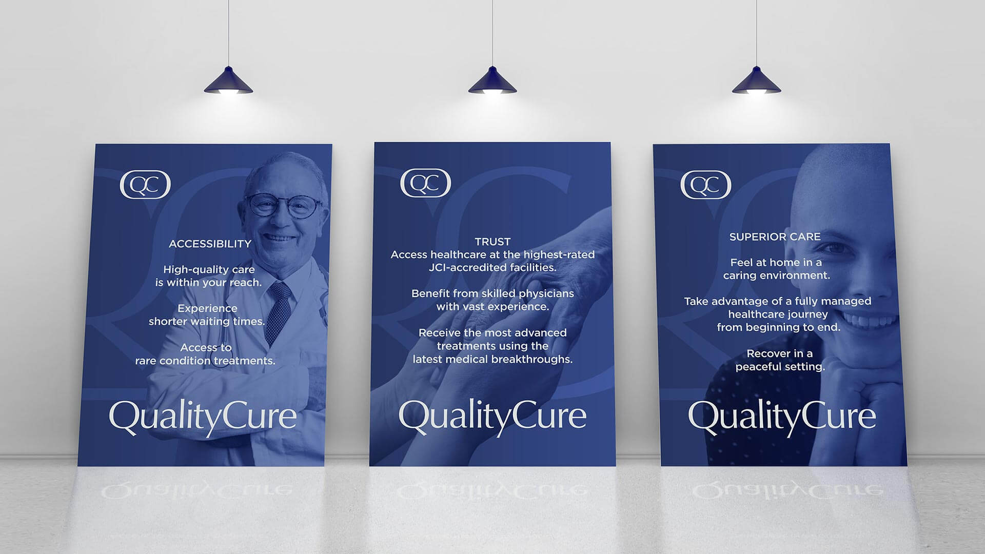
The initial step involved developing a strategy after conducting interviews with executive-level managers. The primary concern highlighted in the strategy study was the apprehension regarding the quality of service when seeking treatment abroad.
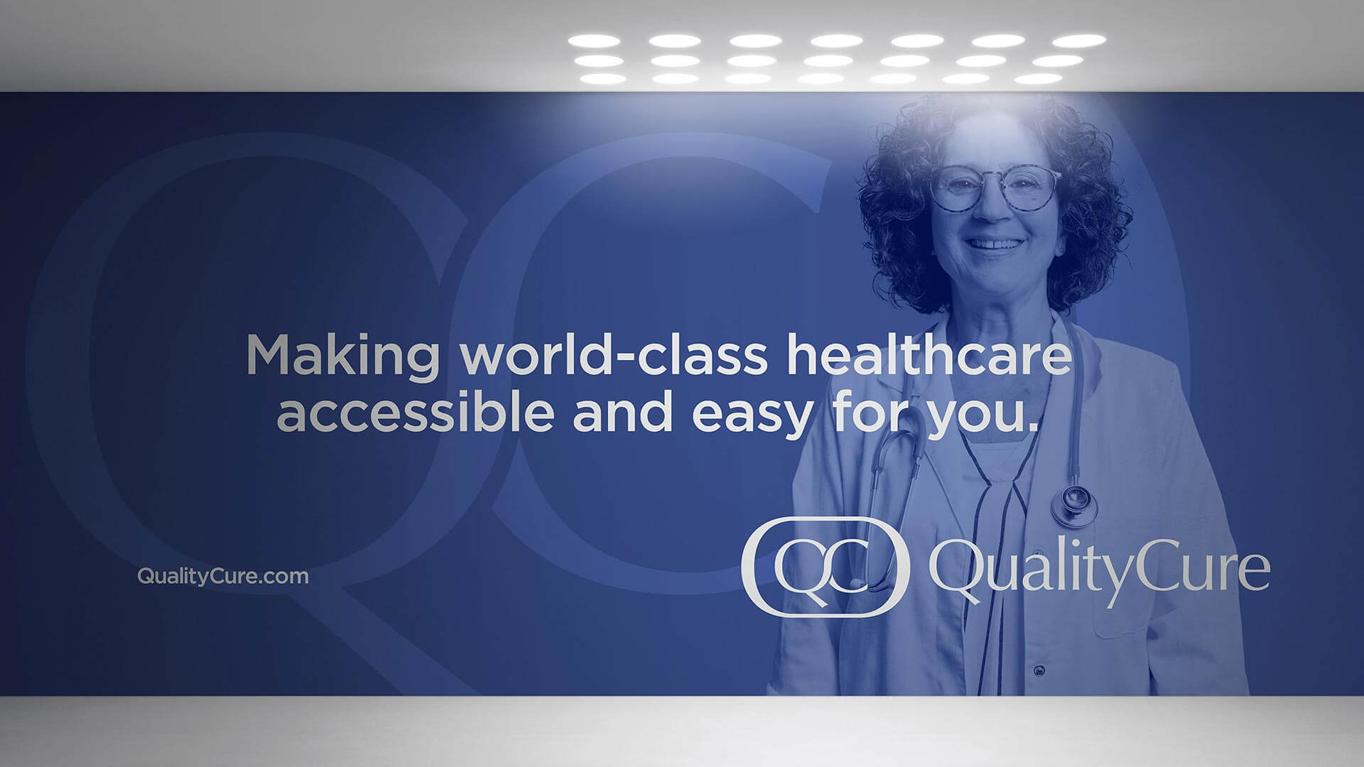
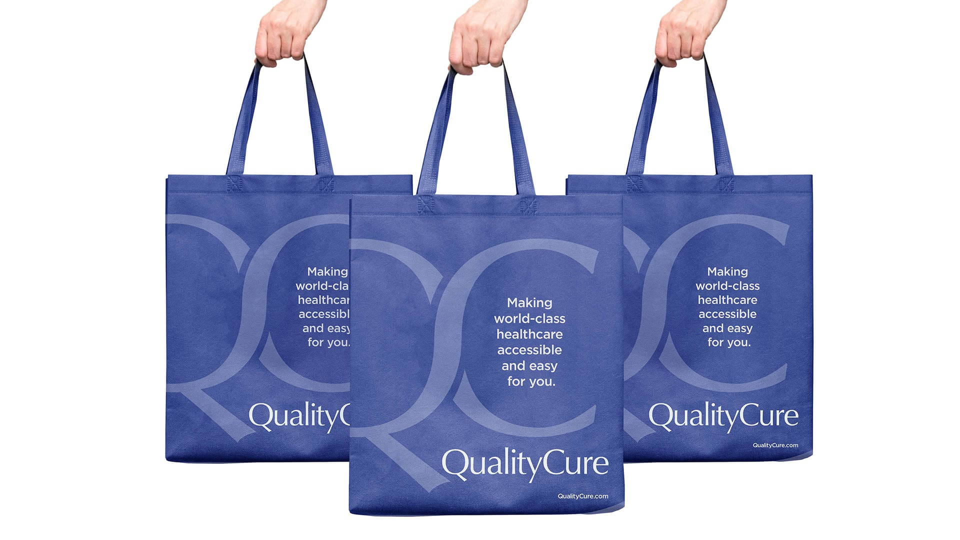
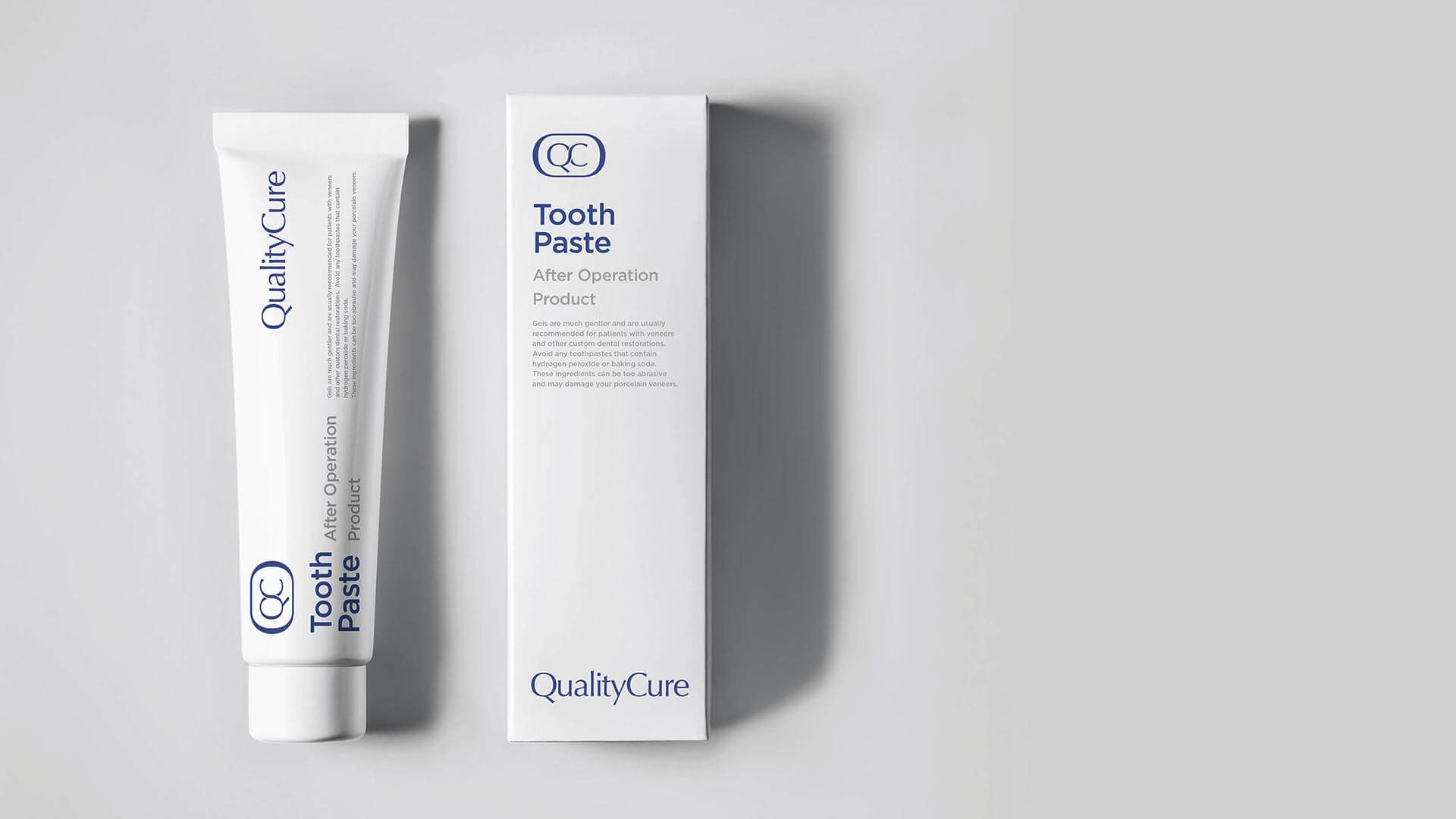
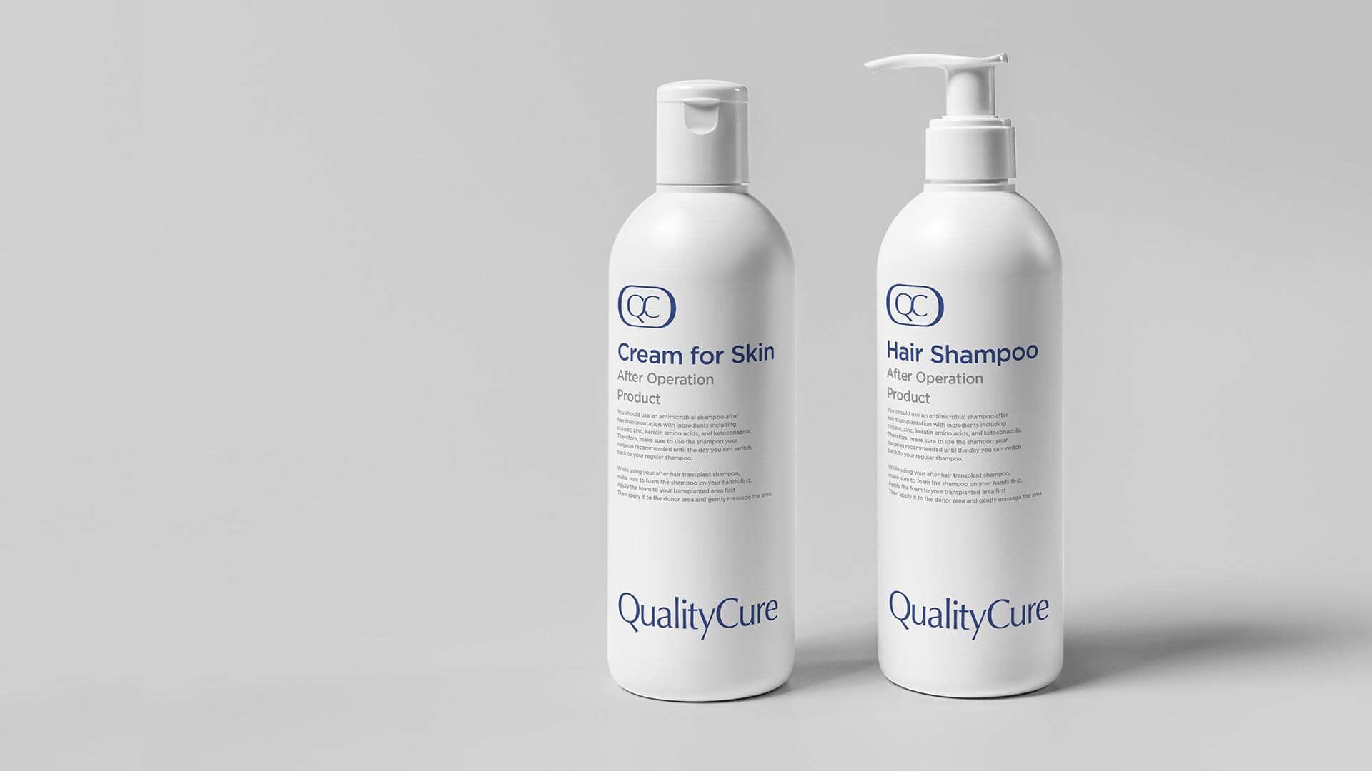
Given this concern, the decision was clear to prioritize and emphasize quality in the naming process. Descriptive names, simple yet result-oriented, were chosen to clearly convey the nature of the service, particularly for the USA market.
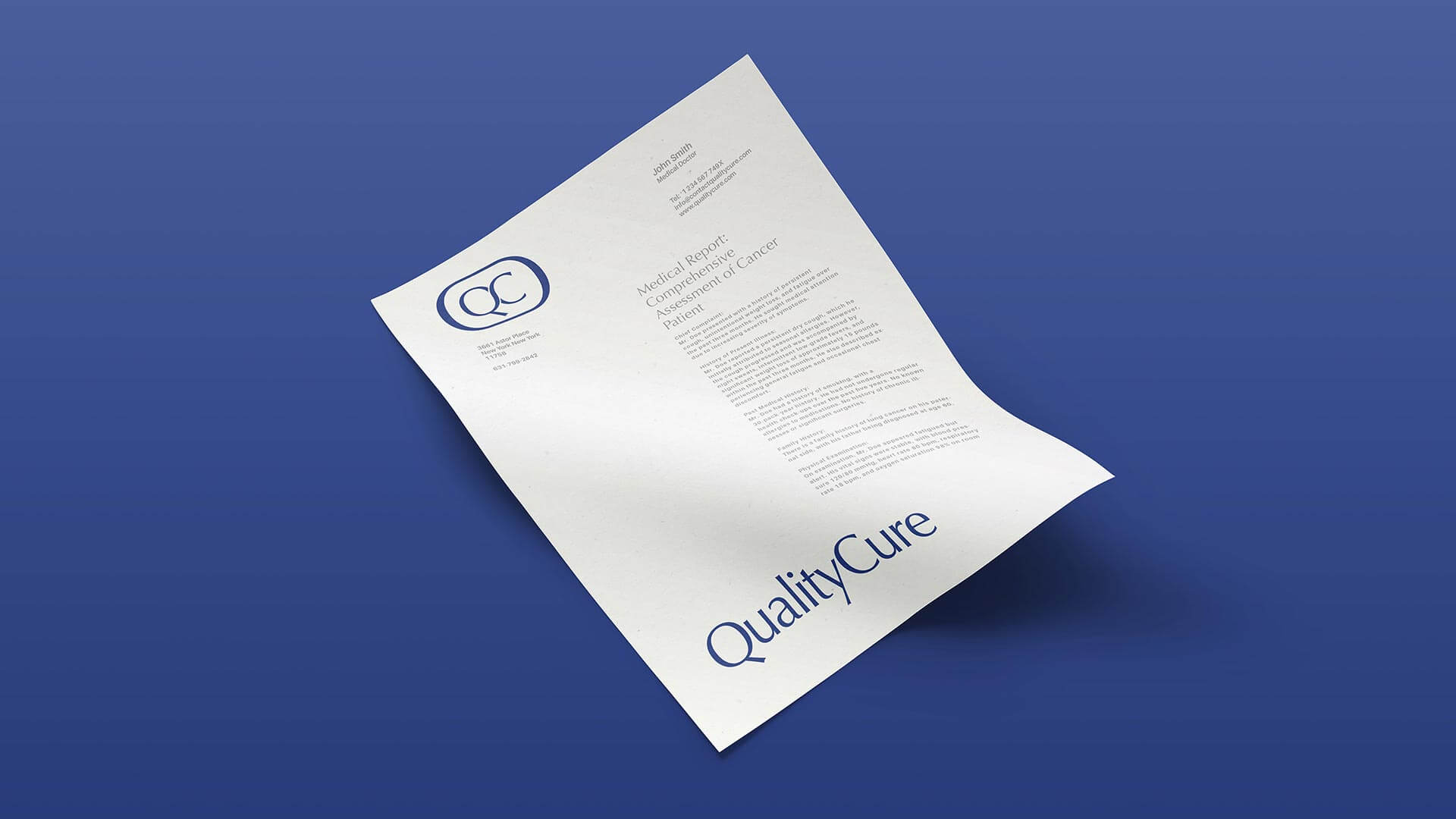
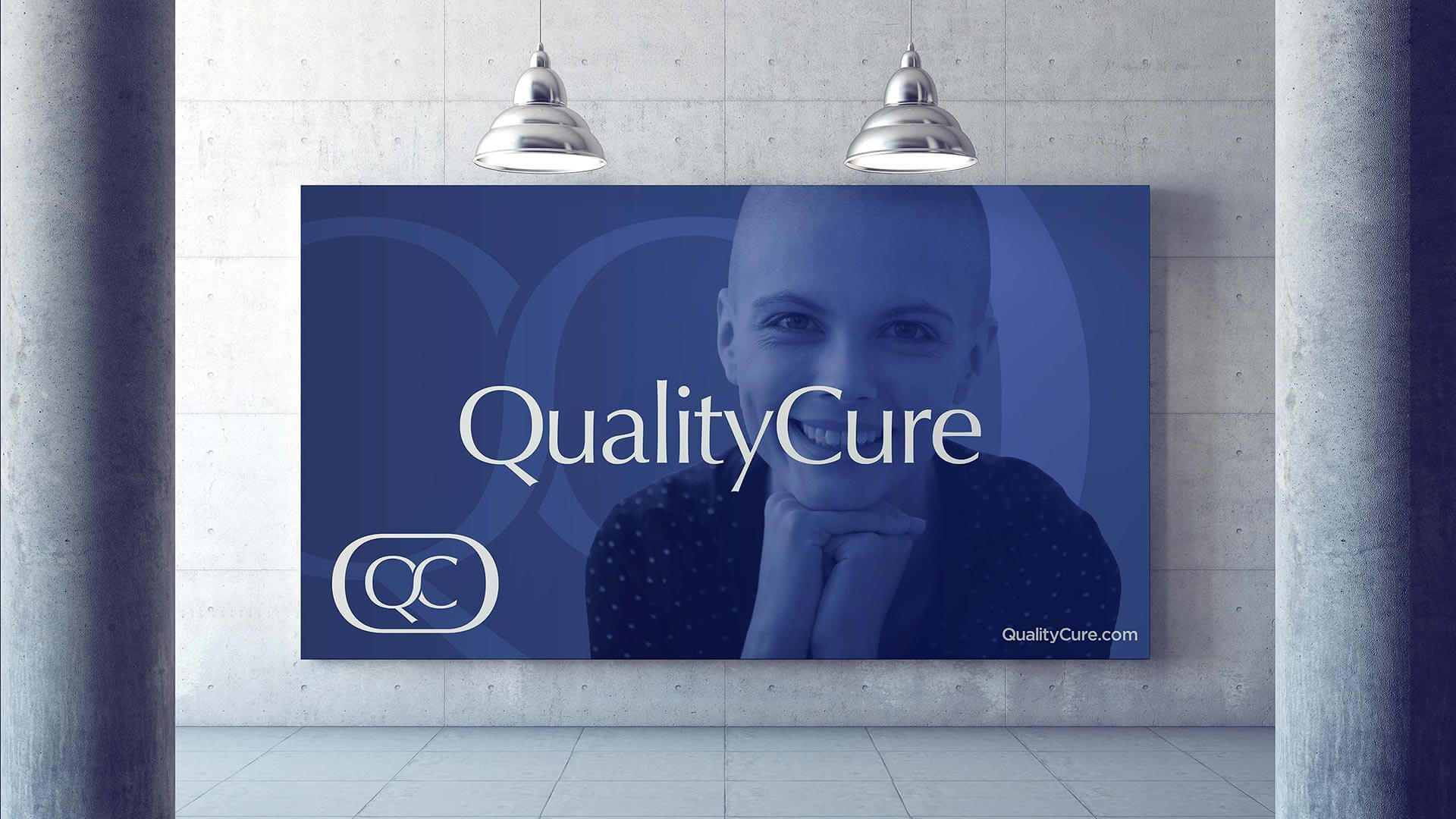
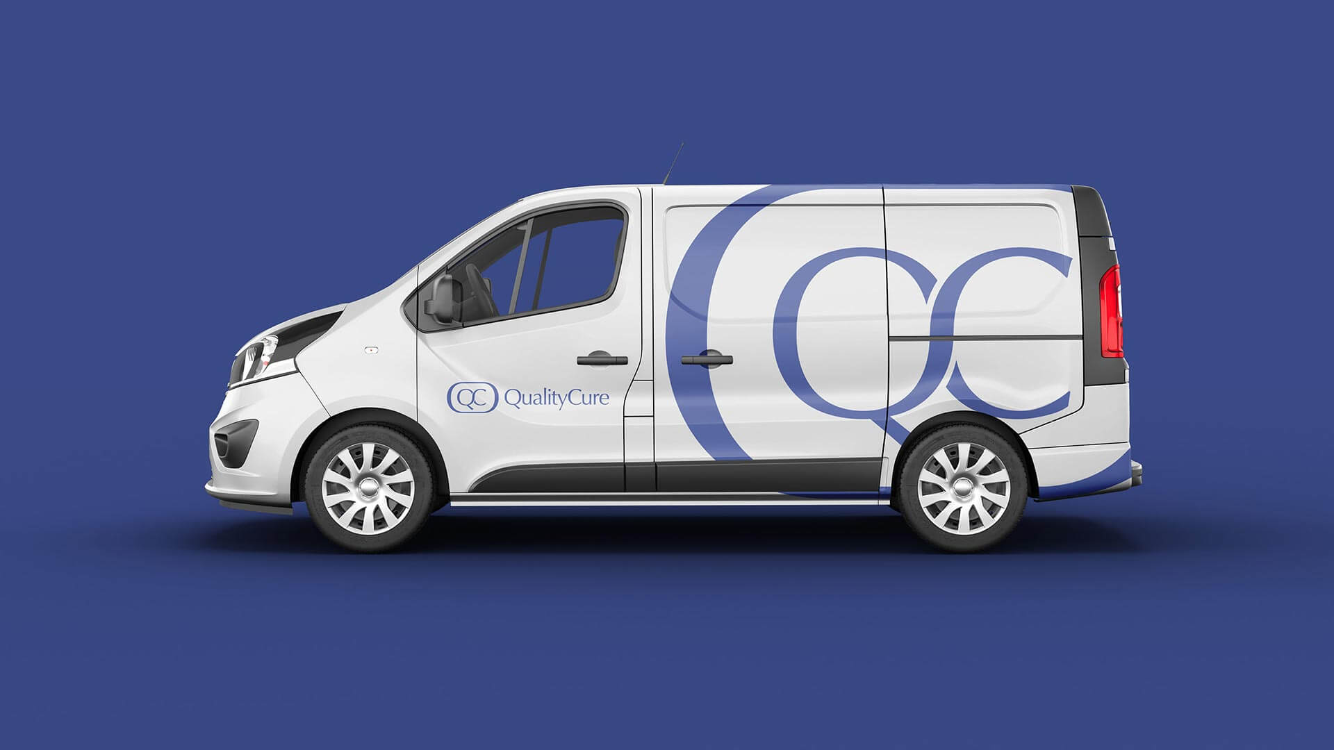
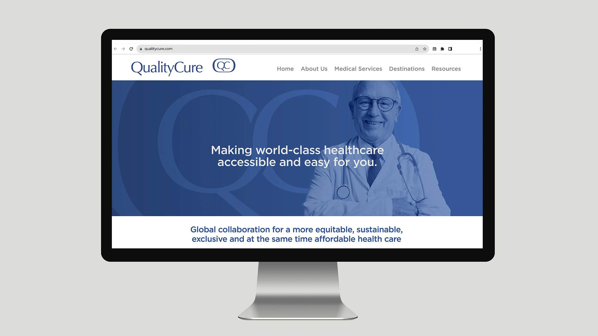
Upon approval of the name QualityCure by the client, a conservative approach was adopted for the visual identity, reminiscent of the branding in the American healthcare system. The dark blue color selected in the color palette aligns with the corporate world and maintains a conservative aesthetic.