Museum Branding

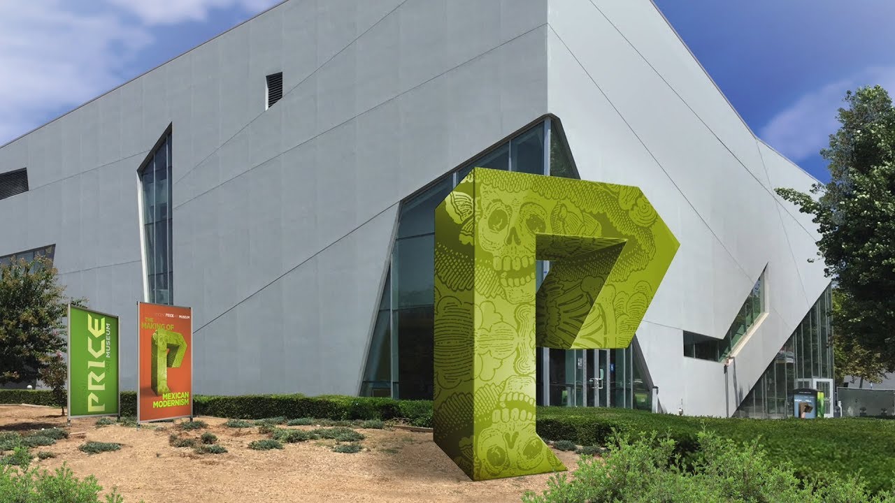
In case of Vincent Price Art Museum, the cultural focus of the exhibitions and architectural language of the museum building were good starting points.

Imagine the museum as a voice. Like the voice of someone you trust, or the voice of your navigation system… or even better, the voice of a very good audiobook narrator. What the voice says changes each time it speaks out, but it remains constant in its own qualities and manner. You enjoy listening to it. It adds quality to the material. It makes the paragraphs fluent and ideas accessible.

You may even start associating the writer of the book with the narrator’s voice. Your life is enriched by the book and you feel deeply moved. Deep inside, you associate all these feelings with the voice. If you come across another book recorded by the same narrator, you would inevitably be expecting a similar experience. In fact, this expectation you project could change the context of the book, the way our receive it, and possibly even the meaning of it.
IDENTITY & BRANDING

CASE STUDY

Having defined our goals and the communication strategy, we can start designing the voice or the “spirit” of Vincent Price Art Museum. Ideally, everything that comes from the museum should be spoken out with the same visual voice, no matter what the message is. The audience should be able to say: “This is Price speaking! We enjoyed listening to its voice and what it said before. Let’s see what it has to say now.”

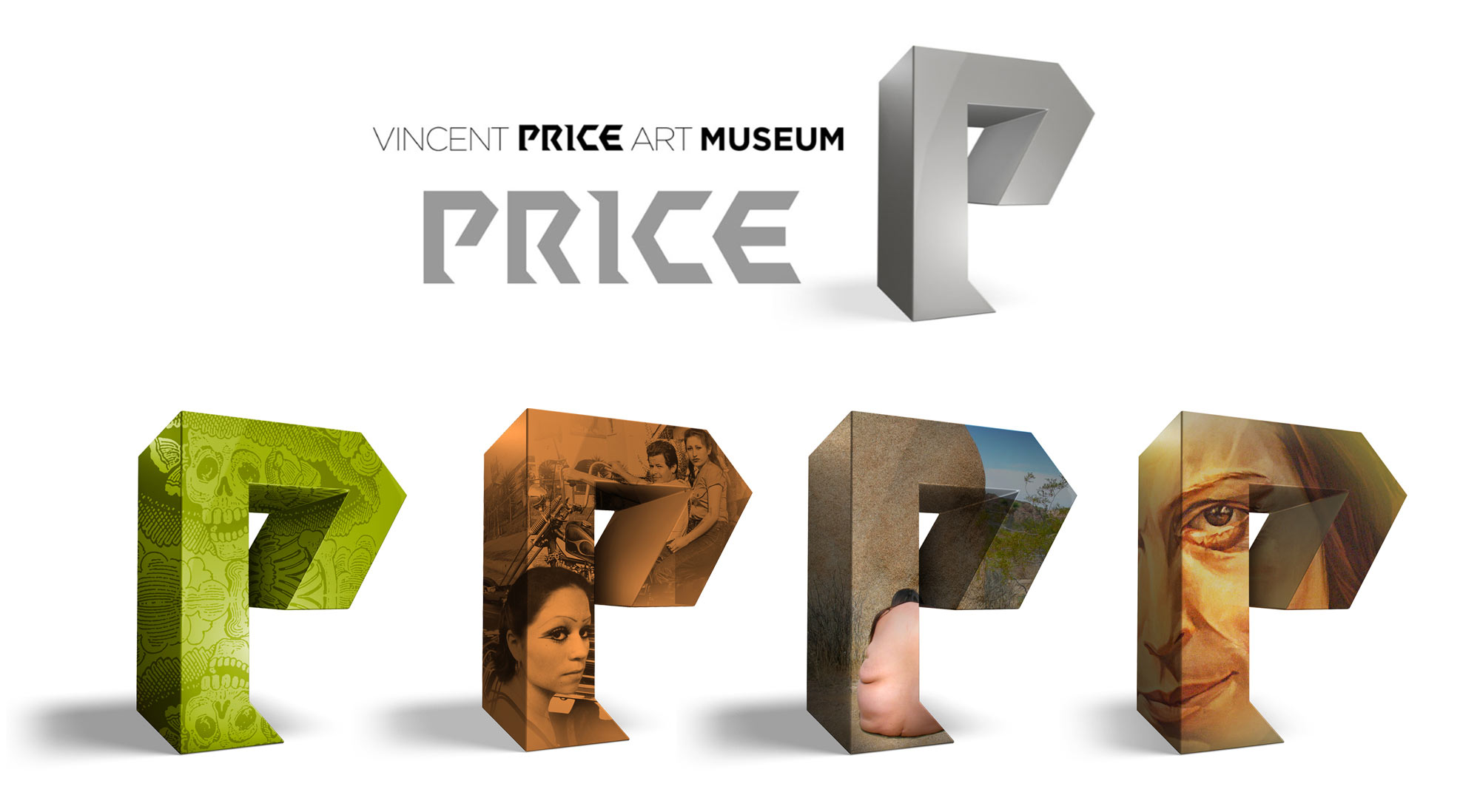
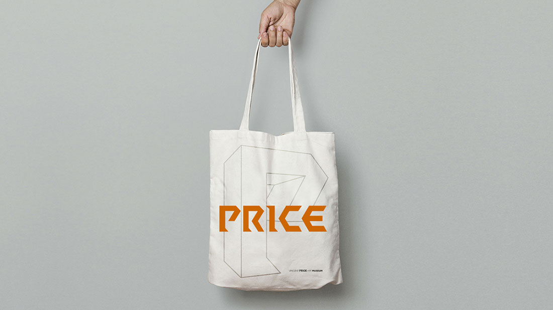
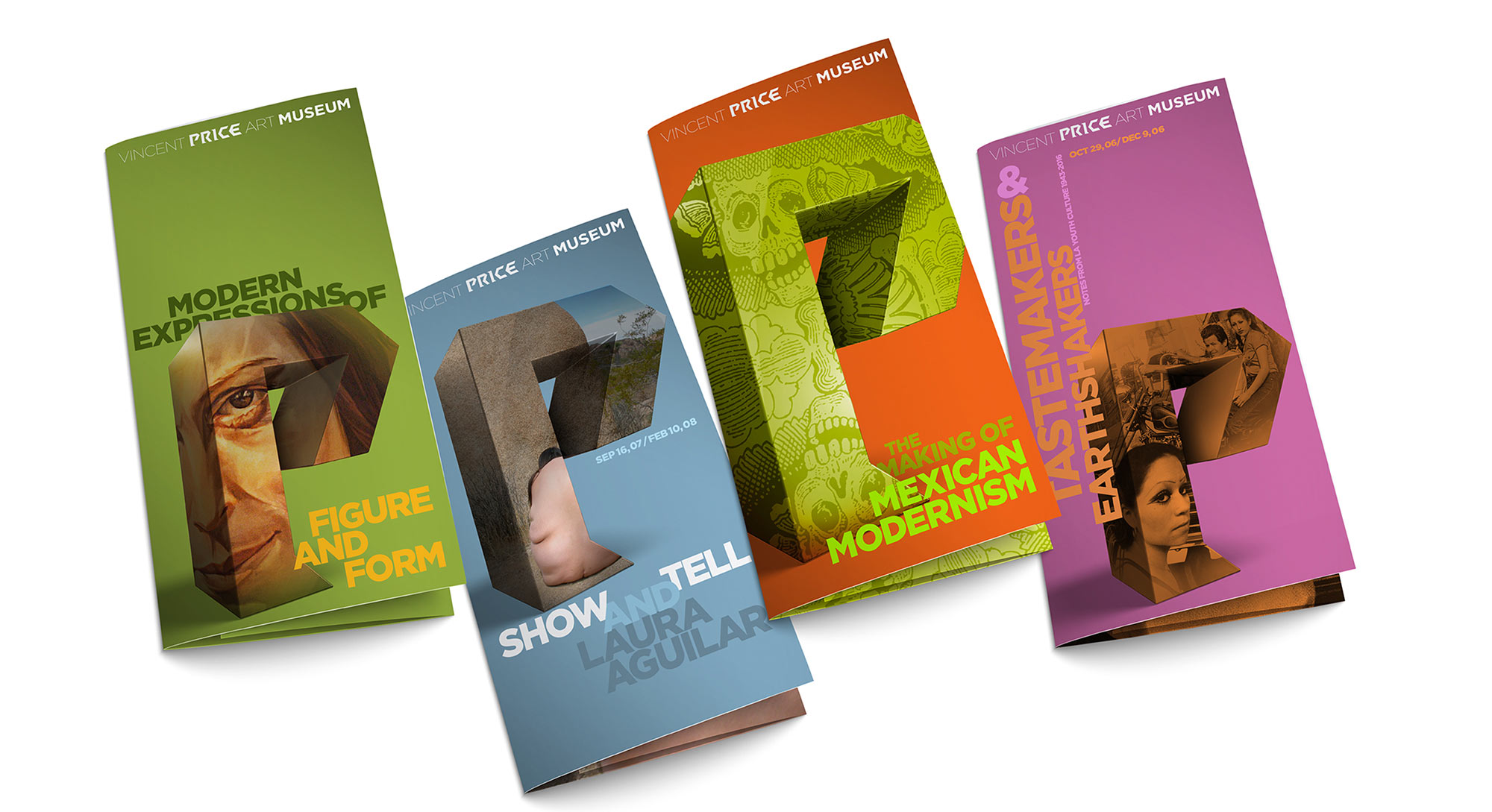
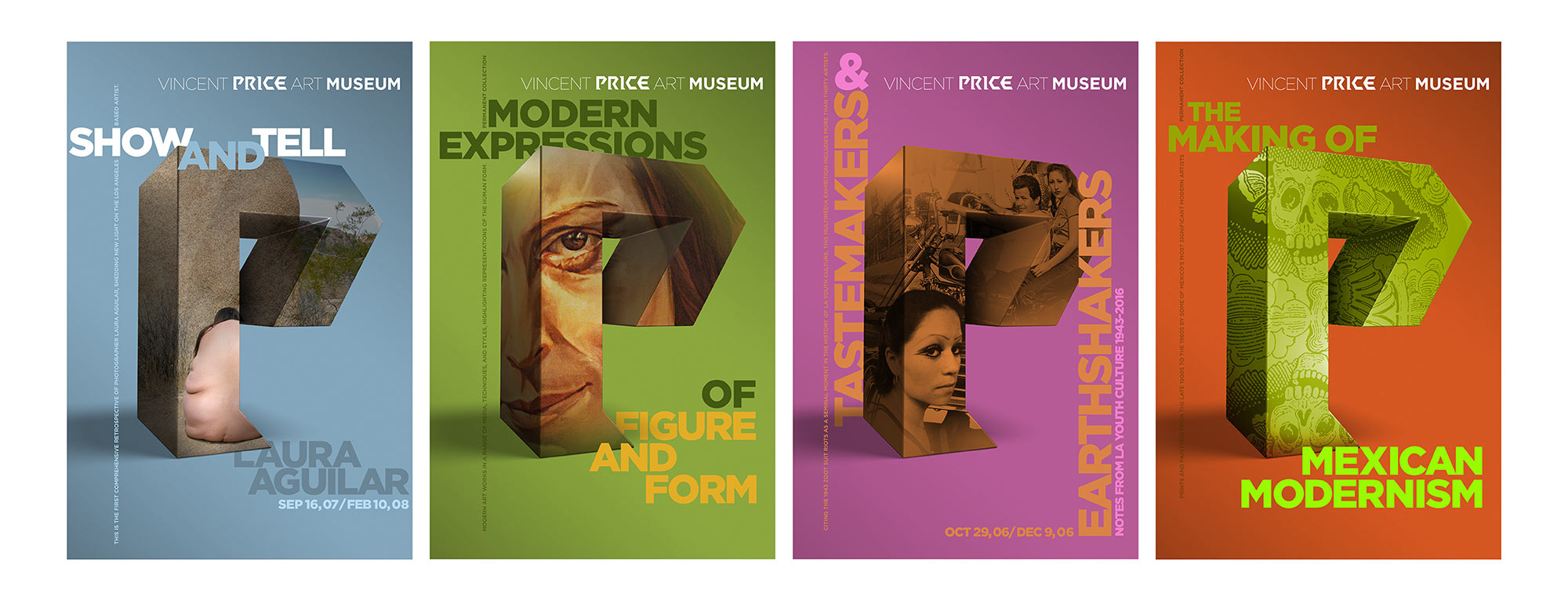
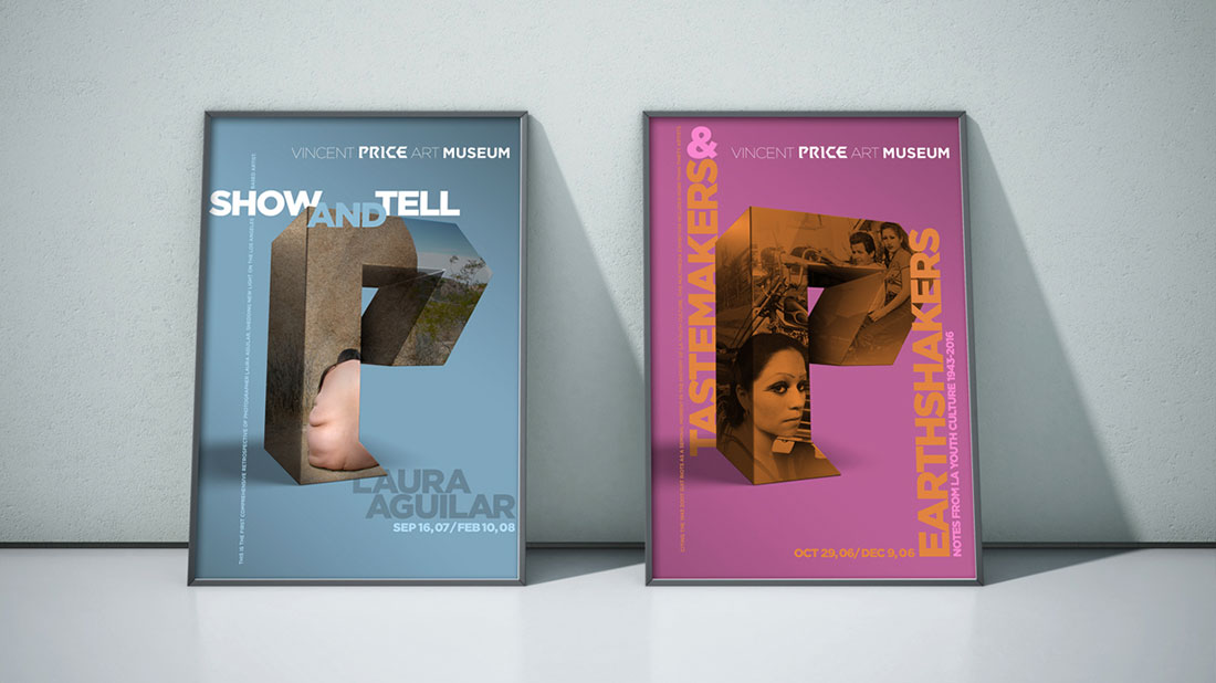
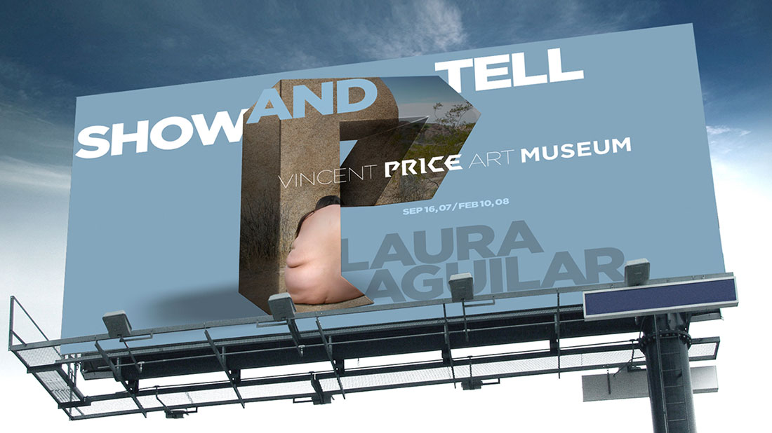
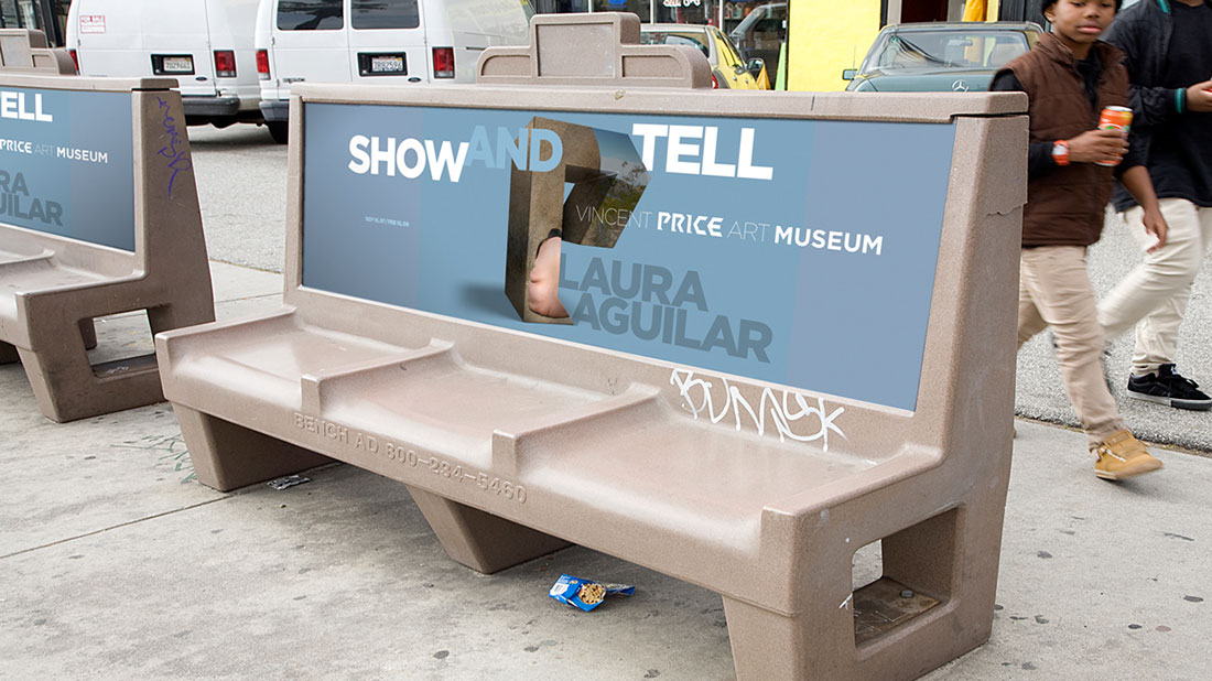
Improving recognition requires and also brings with itself, the shortening of the museums name. We recommend a two-step gradual change in how the name of the museum is displayed. The first step is a typographical fade-out. At the second stage the name Price and even the letter P will be recognizable as the signature of Vincent Price Art Museum.

DESIGN LANGUAGE

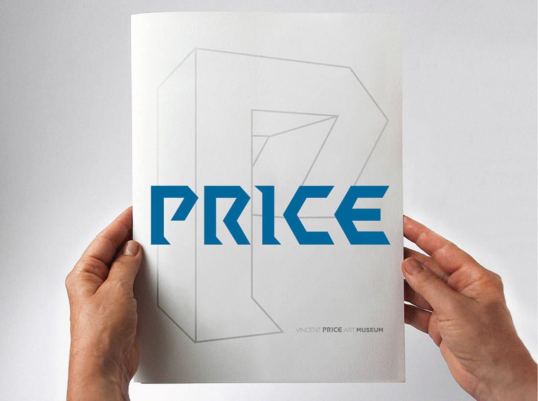
We don’t believe in inventing identities. We believe in extracting them. In case of VPAM, the cultural focus of the exhibitions and architectural language of the museum building were good starting points. We concentrated our initial efforts in finding a good typographical match to the voice of the museum. A typeface that complements and accentuates the inherent identity.

Be it a publishing house, a concert hall or a film festival, defining the identity of any cultural or artistic arena always has a particular challenge. In our case, the challenge is to be recognizable while still remaining in the background and hosting another visually strong identity. In addition to this, there’s also the problem of having to represent a body of work or an entire curatorial collection with a single painting or a sculpture.

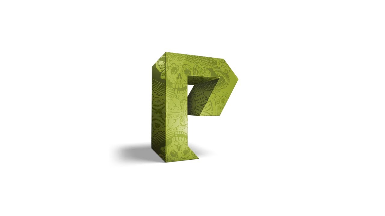
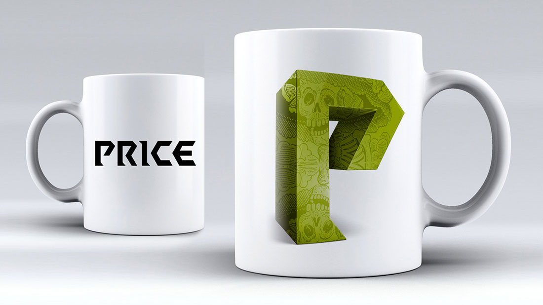
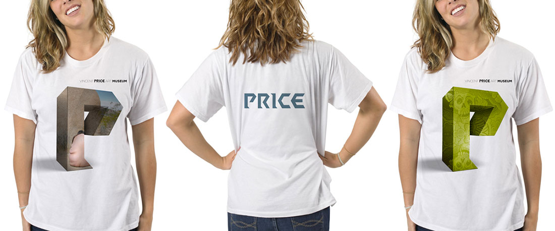
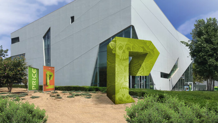
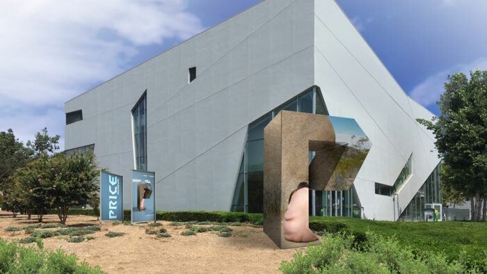
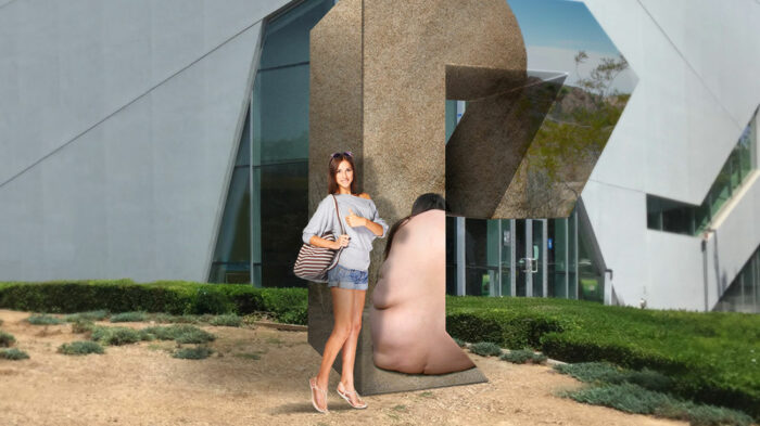
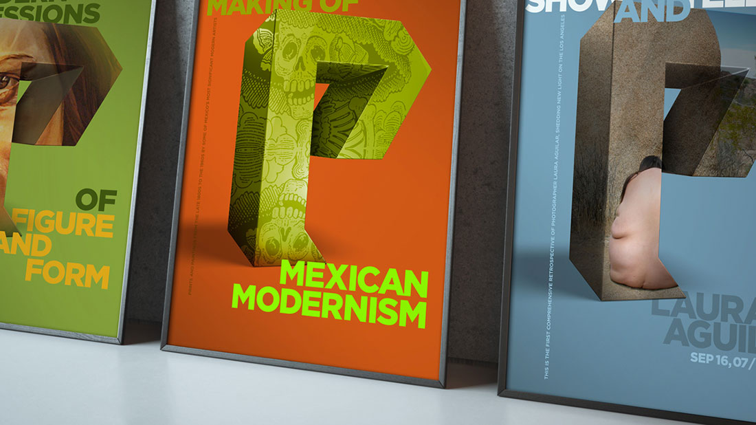
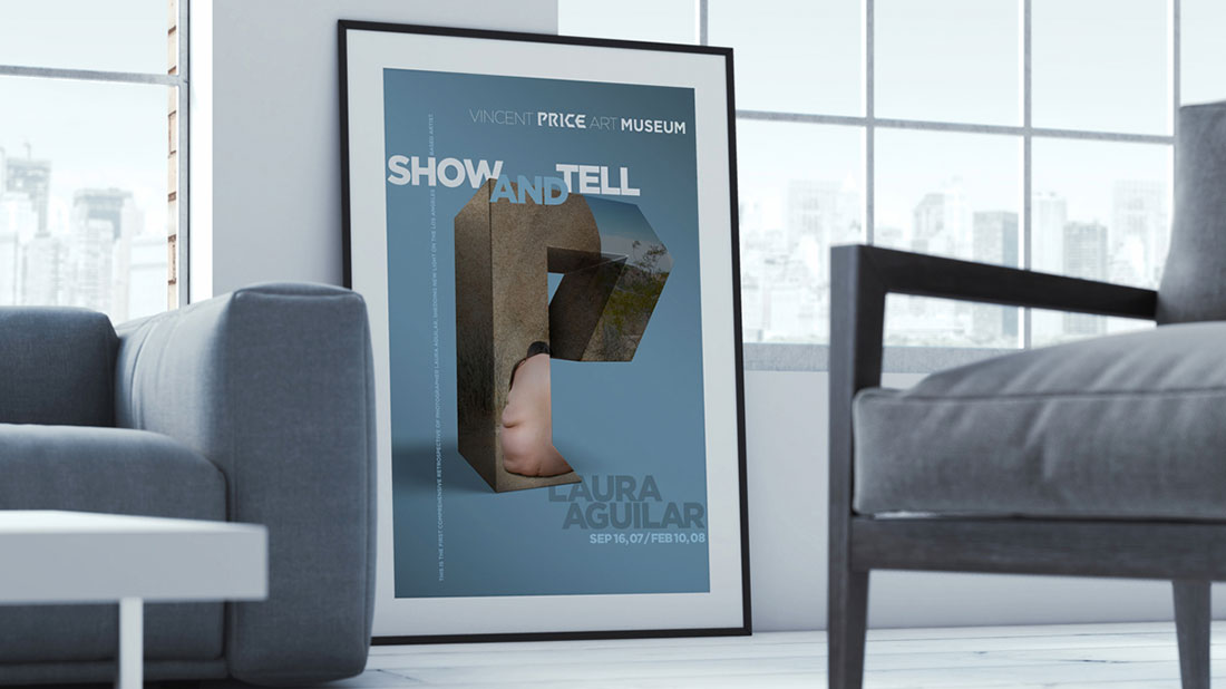
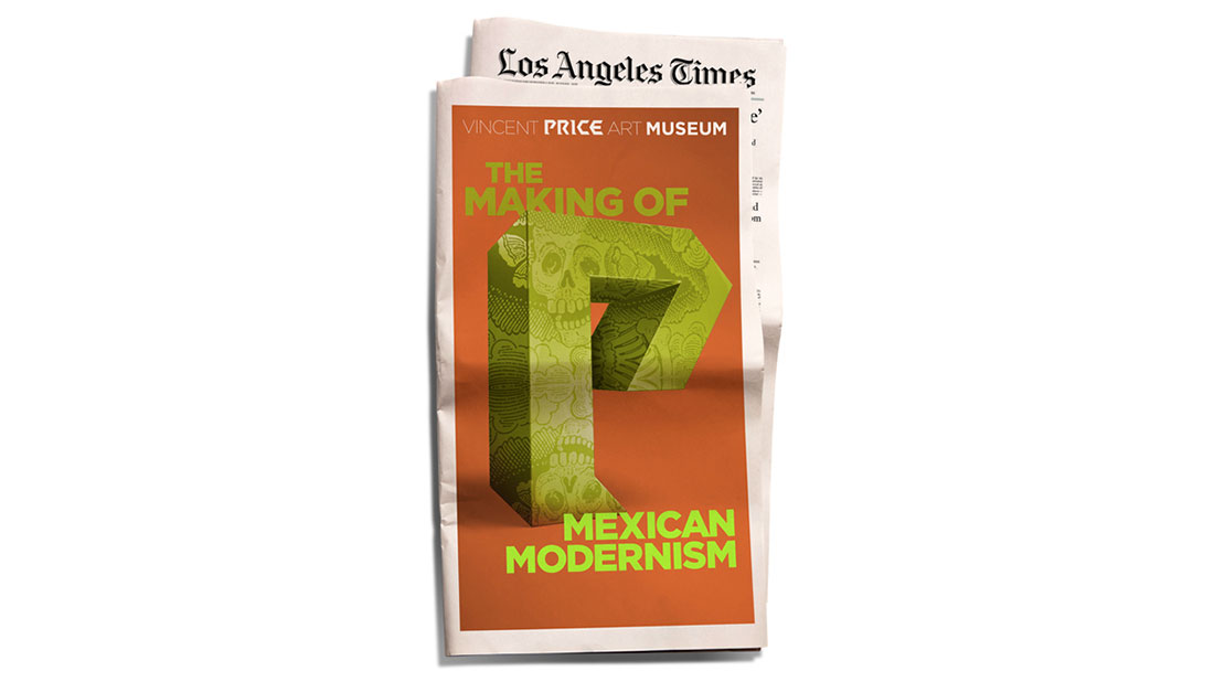
With the usage of the iconic “P” as a containing element, we believe both problems are resolved simultaneously. The three dimensional “P” changes its appearance with each exhibition and it hosts a collection of recognizable pieces within itself. In a way, the visual solution is an analogy of the museum building and the body of work it holds within. Once the identity is established, we also recommend using more abstract POV renderings of the letter “P”.