Re Branding

Our challenge was to convey the message that there are different kinds of art that speak to different kinds of people, and art, with its many different disciplines, should be accessible to everyone.

We’ve all heard the timeless discussion about the purpose of art: Art for art’s sake or art for life’s sake? Whatever the opinions may be, one thing is for certain: That art is great for everyone.

In 2019, I Mean It Creative took this notion as the basis for İş Sanat’s new branding strategy, when we had the pleasure of assisting İşbank’s art division with its branding needs.

İş Sanat’s mother organization, İşbank, is not only Turkey’s largest bank, but the very first one founded by the Turkish Republic. This is a pioneer bank, founded on the principles of the Turkish Republic’s founding father: Mustafa Kemal Atatürk. It is an organization that represents innovation, transformation and the future- so its art division needed a strategy to match.

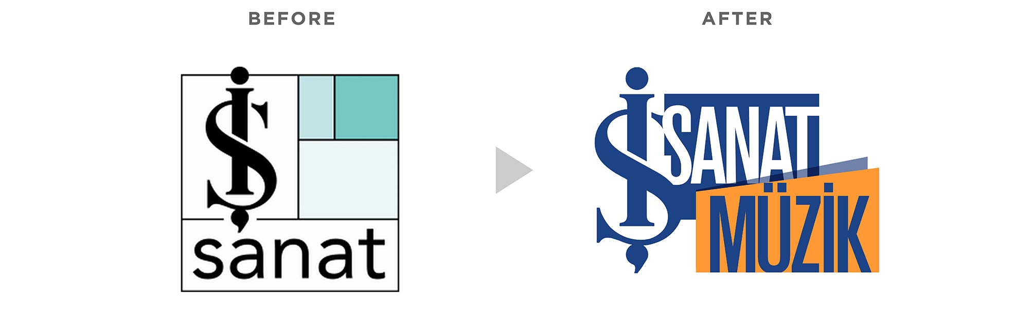
We initiated our strategy with how İş Bankası was positioning itself and how it was being perceived by the public. Associated with the birth of the republic, this mother organization was often connected to tradition, elitism and the past.

Instead of developing our strategy in this direction, we decided to shift gears and shape İş Sanat to be more accessible, understandable, approachable and even fun. Because art is fun, and at İş Sanat there is something for everyone. To celebrate the variety and multitude of artistic disciplines, we wanted to convey the feeling of a 24/7 festival with events happening year-round.

Art should be an integral part of everyone’s life, and organizations should prioritize providing art with all its range of disciplines that appeal to different tastes. This idea around accessibility and inclusivity and what led to our main strategy:
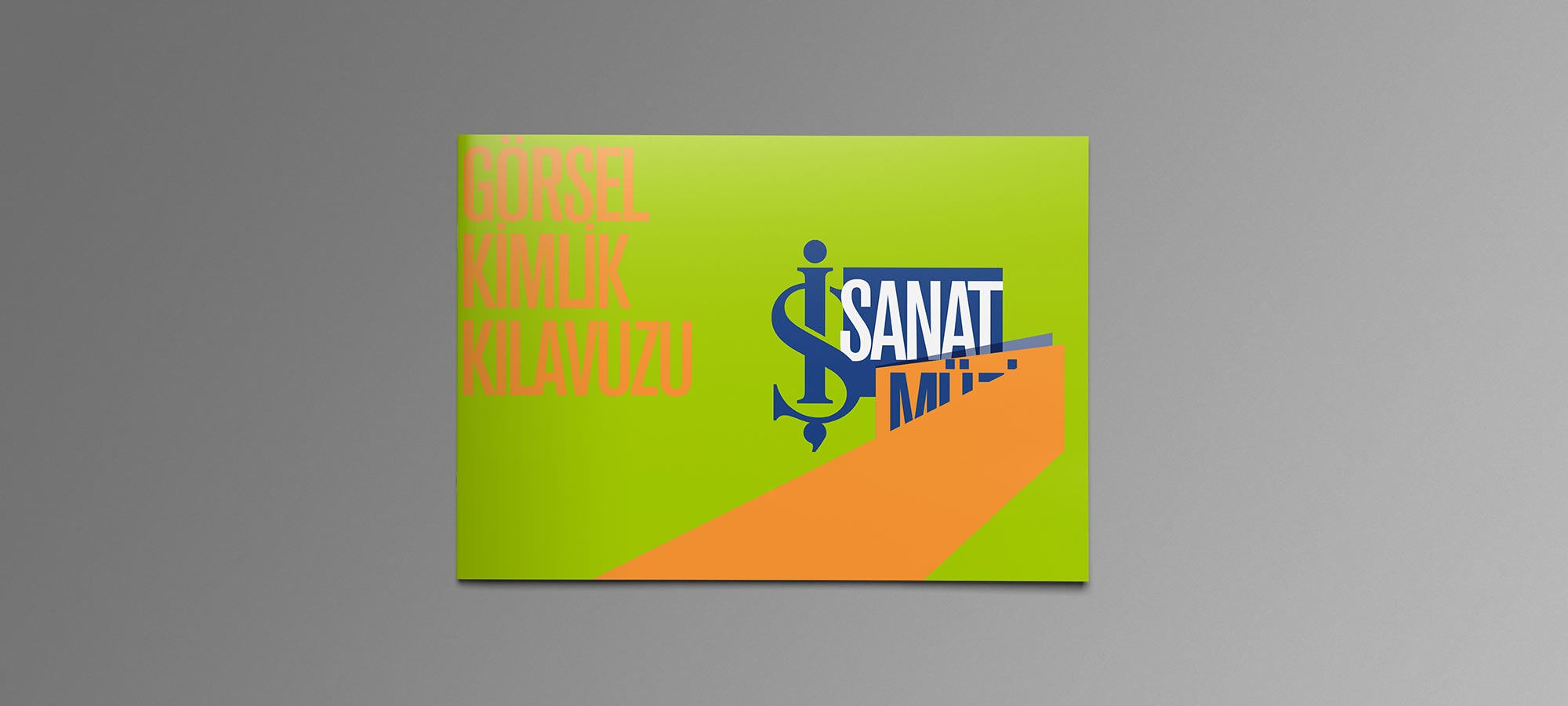
#İşteHerkesİçinSanat

Translated from Turkish: İş Has Art For Everyone.

A play on the word “İşte” meaning “Here!” in Turkish- the hashtag means: art for everyone is here. As well as at “İş”, meaning, at İş Sanat. So, “Art for Everyone is Here”

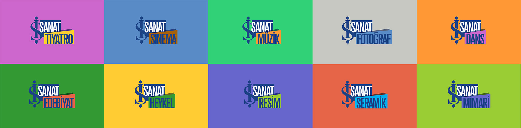
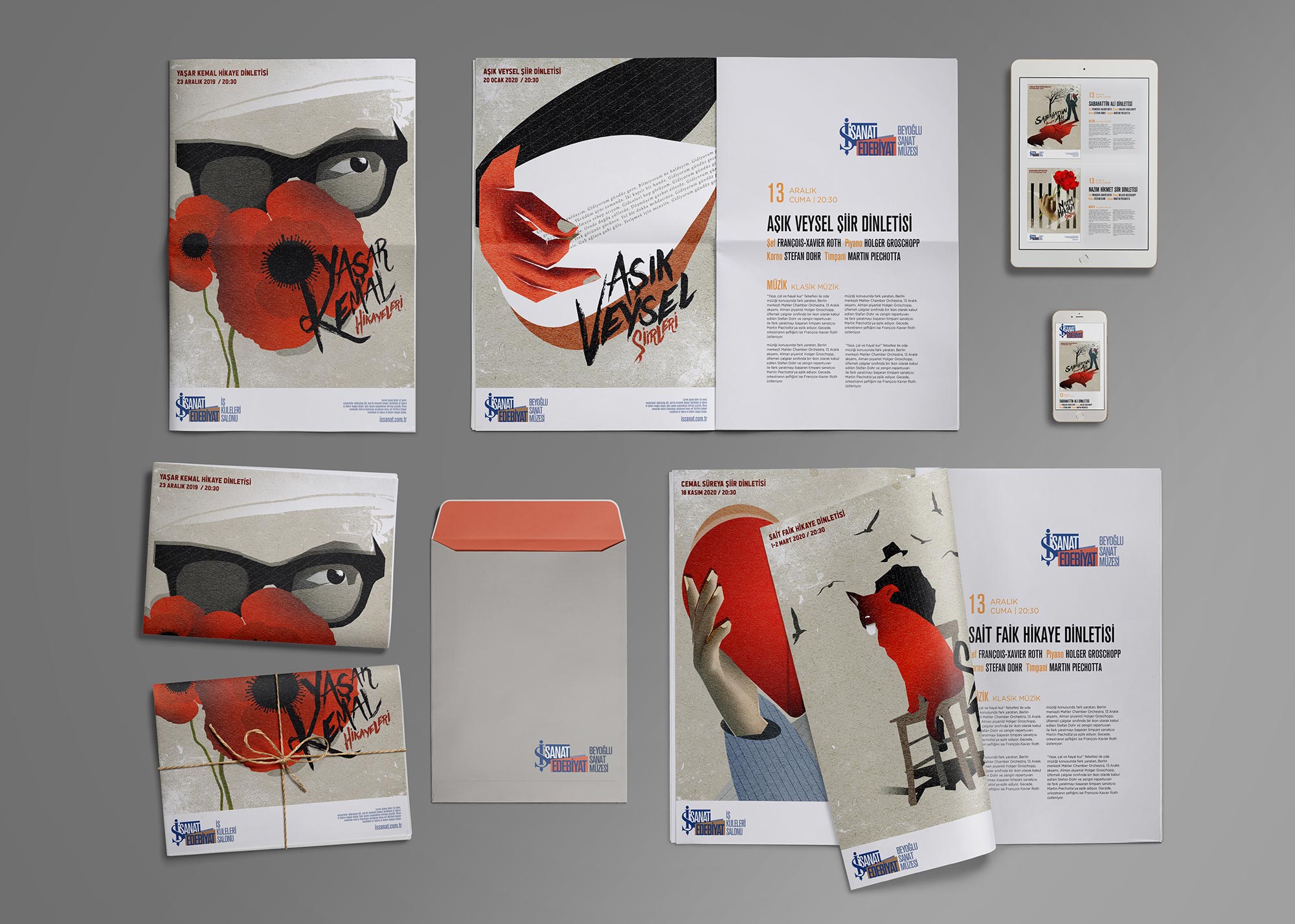
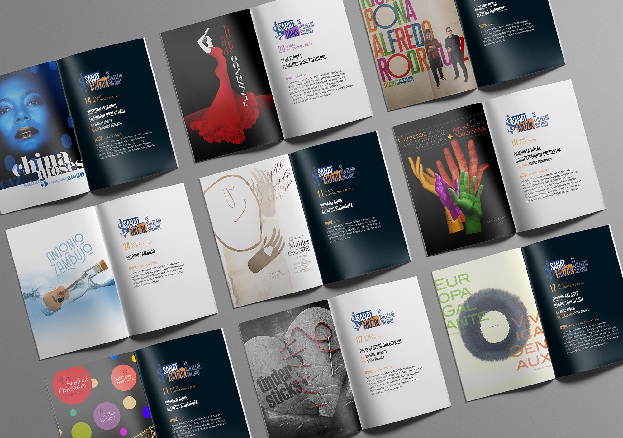
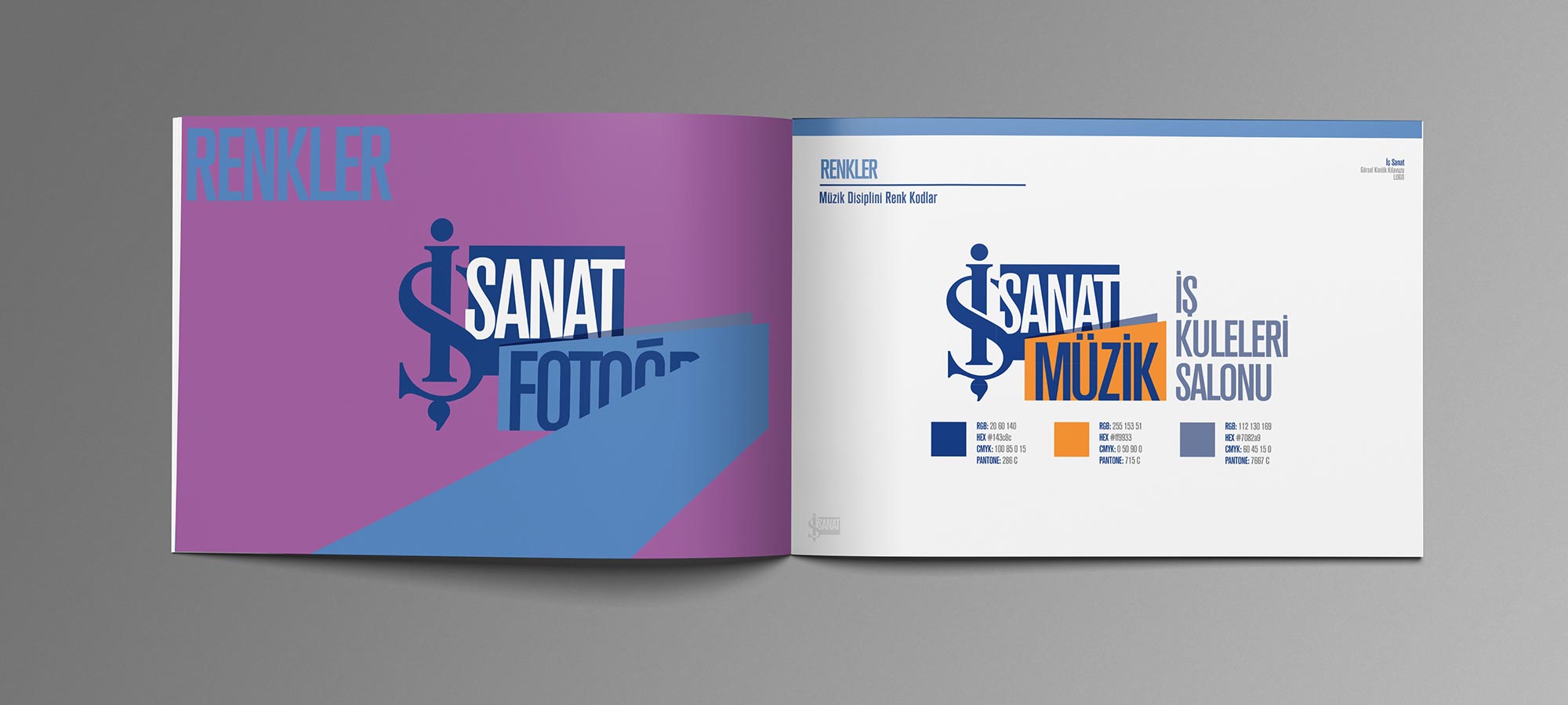
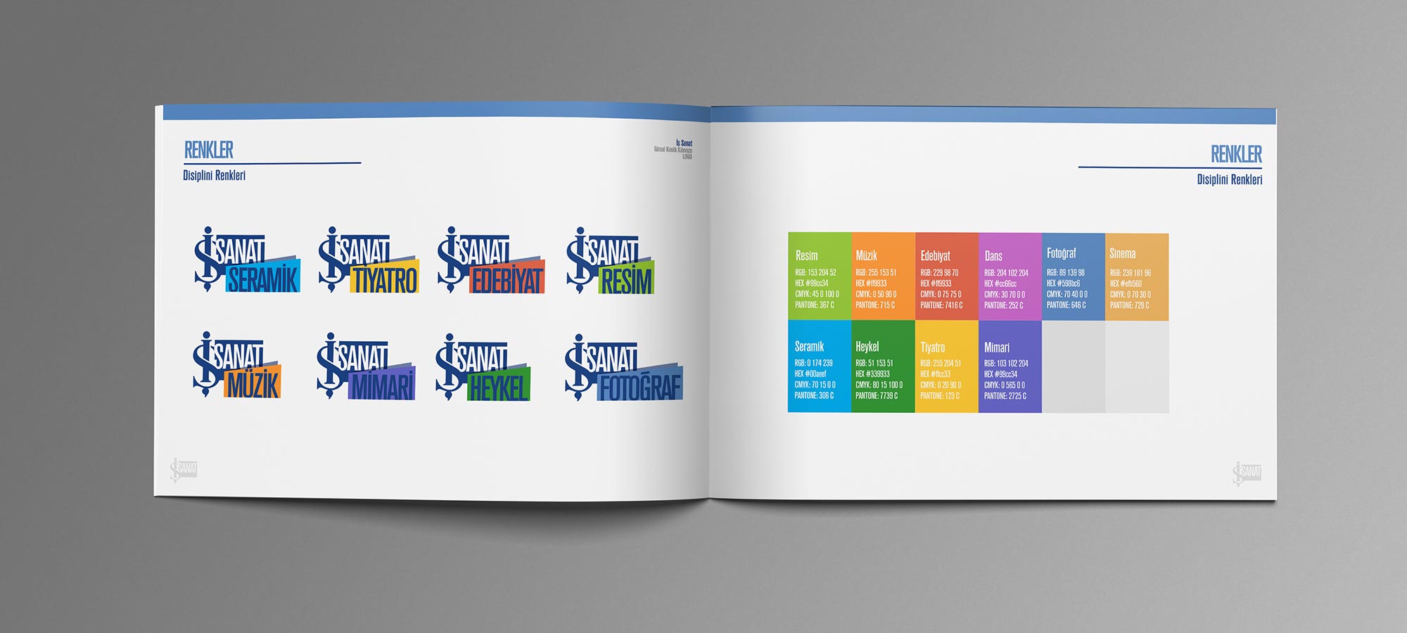
İş Sanat offers events from a range of 10 different disciplines of art. These events take place at various locations around the city of İstanbul and range from psychedelic rock concerts to poetry readings. There is a mix of both international and local artists, in addition to well-known names and brand new talents.

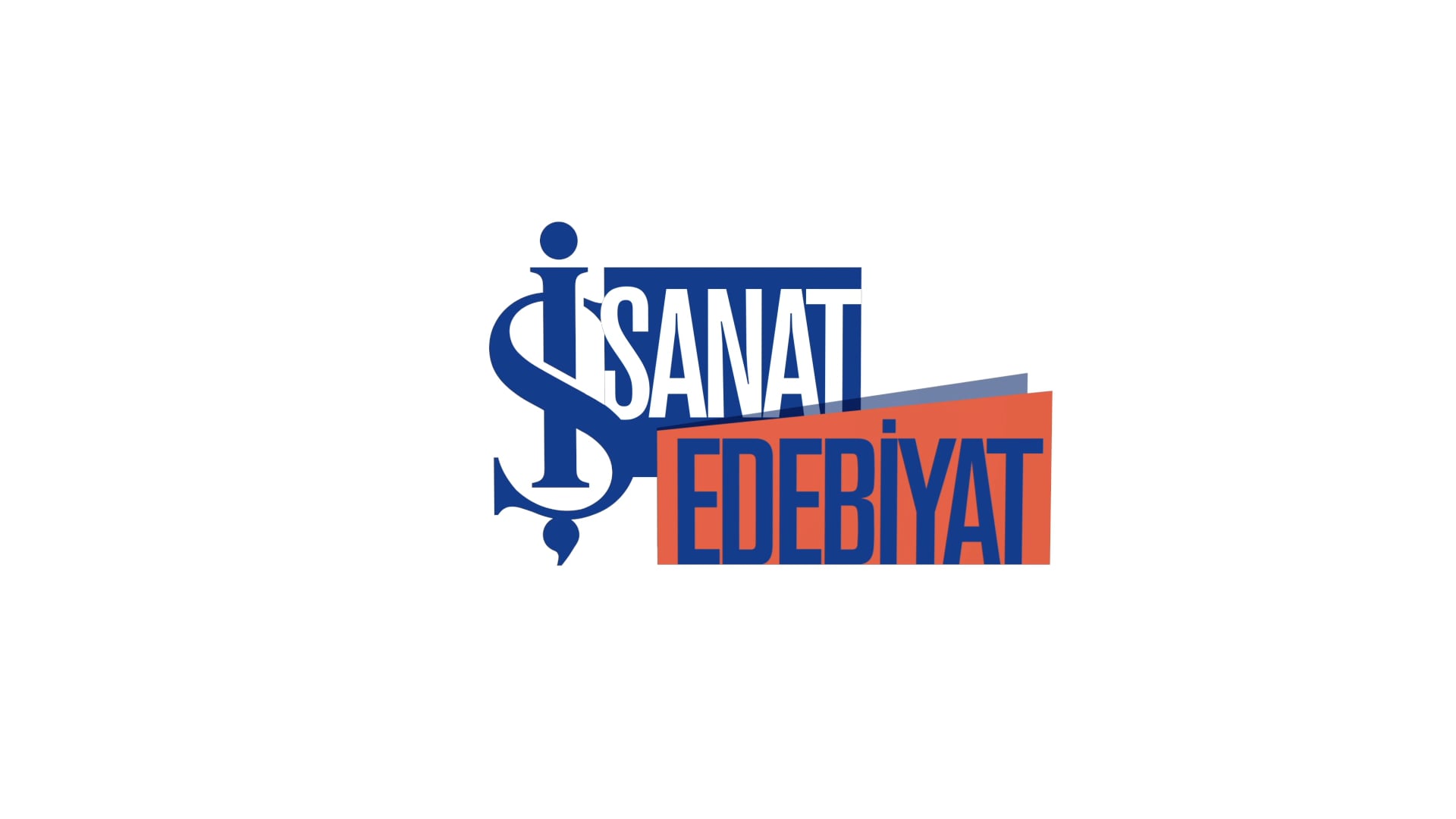
We needed to create a structure that both showcases and organizes this rich variety.

Our challenge was to convey the message that there are different kinds of art that speak to different kinds of people, and art, with its many different disciplines, should be accessible to everyone.

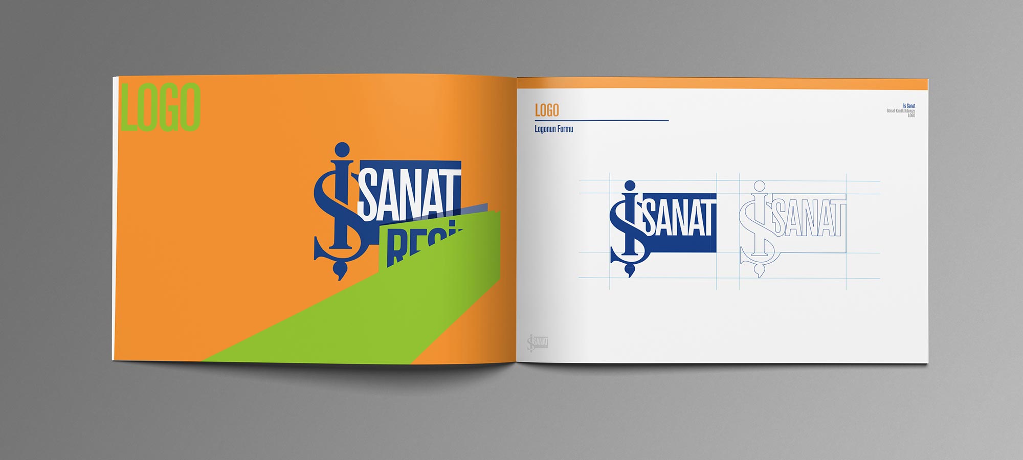
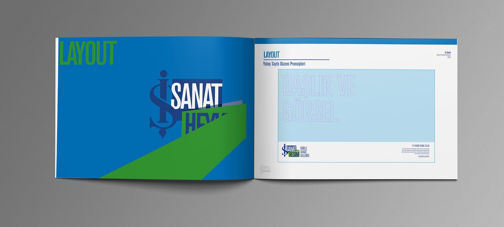
This meditation led to the creation of a visual identity that communicates an inclusive and transformative spirit.

Our holistic approach is rooted in a modular structure that both celebrates Mustafa Kemal Atatürk’s philosophies, and systematizes the variety of artistic genres that İş Sanat offers to the public.

The new İş Sanat logo represents the heart of this revived branding strategy.

Using the bank’s iconic two-letter logo and expanding on it with a color-coded assortment of İş Sanat’s various artistic categories, we were able to commemorate İş Sanat’s status as both traditional and revolutionary.

Our holistic, modular approach is represented in both the still logo, and our animated sound logo design.

This eclectic sound logo is designed with an intro, followed by a smooth transition between three distinct snippets of sounds from different musical genres, and an outro. Thereby celebrating the rich diversity of art forms.

Showcasing the dynamic and active mission of reaching the public through art, our vibrant design also opens İş Sanat’s doors to a younger demographic.

İş Sanat’s new visual language is based on a modular system with a simple and effective formula that makes up the logo.

There are 3 pieces of information being communicated through the logo. The first one is the company, the second is the discipline of art and third is the venue.

Each discipline is color-coded according to its category. The logic behind this strategy is to emphasize the artistic discipline-we are not just celebrating a poetry reading, for example, but the art of poetry itself.

In the long run, this modular structure will direct İş Sanat to cover more art disciplines. This strategy will not only make İş Sanat appealing for different tastes, but it will also offer new forms for the public to discover and experience.

This modular system is carried throughout all materials and is essential İş Sanat’s central visual identity. It coherently showcases a rich variety of artistic disciplines, serving the idea that art exists for everyone.

The key-art for each genre also has its own visual language. The examples above are from the “Literature” events in İş Sanat’s new season. The red color of the literary category is used both in the logo and the illustrations. The distinct style of these graphics are uniform across all materials such as billboards, print ads, social media materials and more.

To explain and pass on this visual language to future generations, we created a Visual Identity Guide. This guide explains the logic of our modular system and provides important information such as the colors belonging to each category.

The rich, diverse and vibrant visual language is the backbone of İş Sanat’s elevated brand identity. Supported by a simple and effective modular system, our approach is a celebration of different disciplines and their accessibility through İş Sanat.

2019 also marks İş Sanat’s twentieth year, and a celebration of two decades is in order. Both the events and their marketing materials convey the feeling of a 24/7 festival, going on year round.