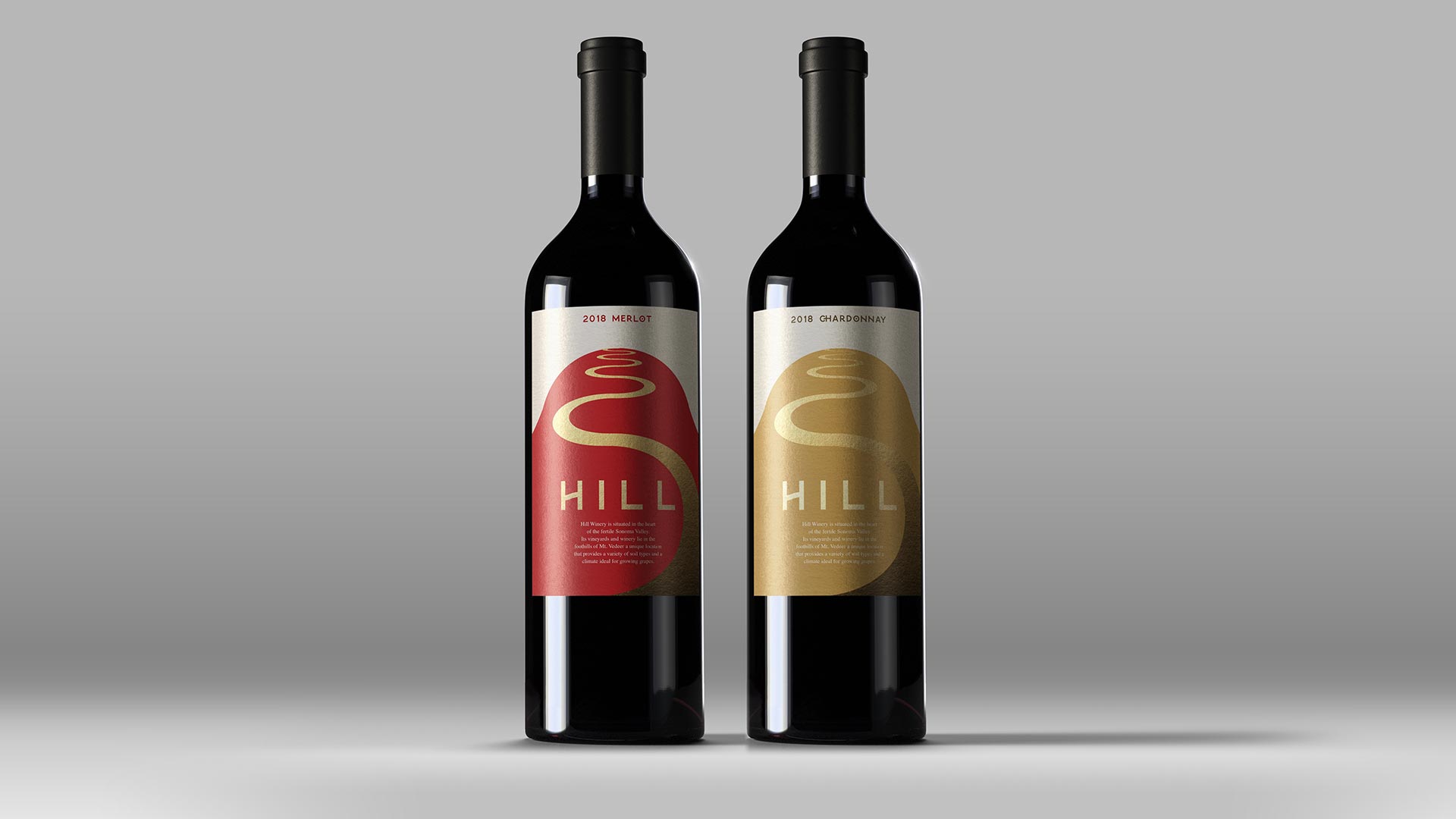
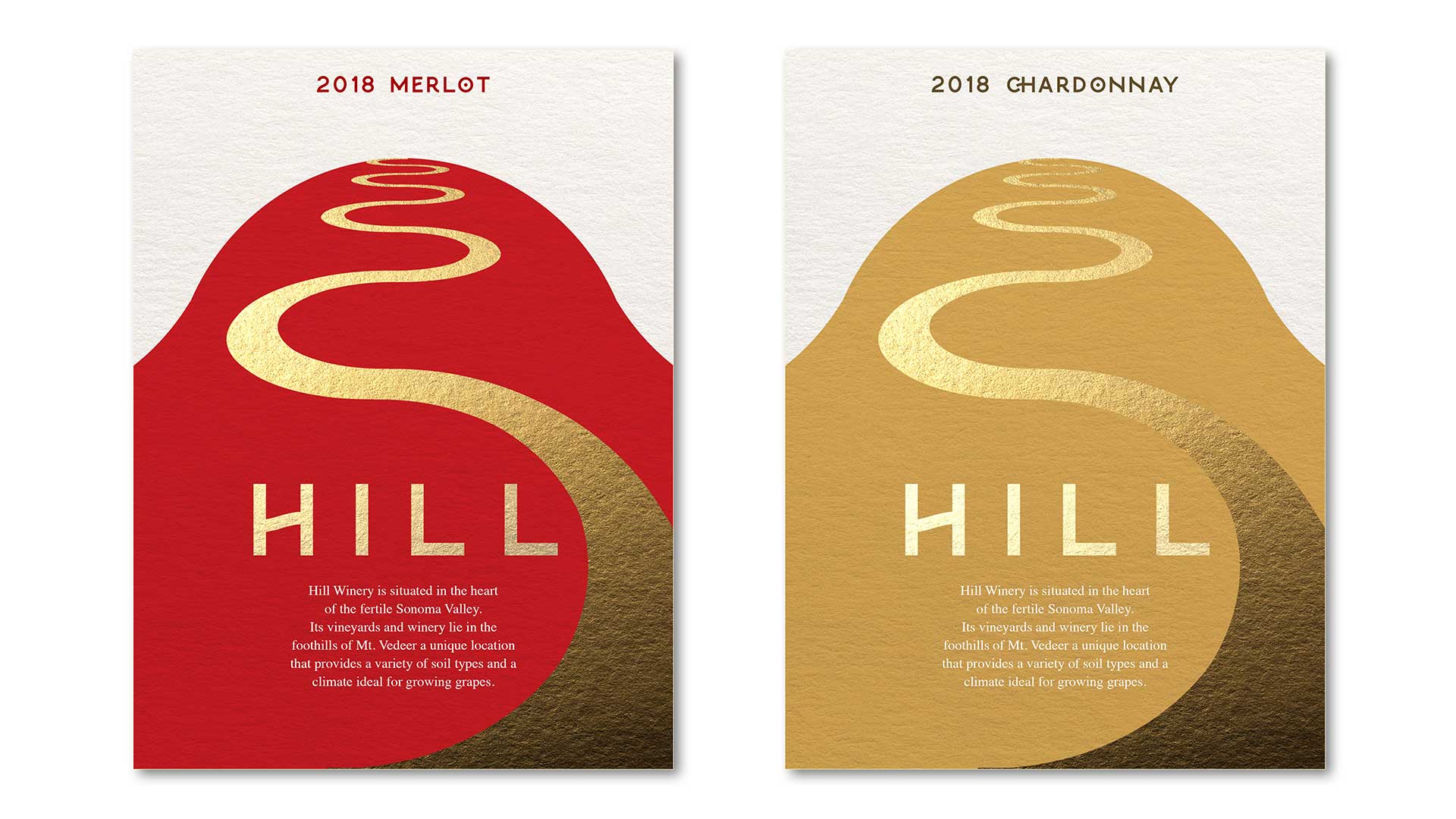
Hill Winery, nestled in the heart of the fertile Sonoma Valley in Sonoma County, stands as a testament to the rich heritage of winemaking in this renowned region just north of San Francisco. With its diverse landscape, the area boasts hundreds of vineyards, ranging from quaint, family-owned estates to internationally acclaimed wineries, all nestled amid the picturesque rolling hills and verdant valleys. Not only known for its exceptional wines, Sonoma County is also celebrated for its natural beauty, with attractions such as the majestic Armstrong Redwoods State Preserve and the idyllic sandy shores of Bodega Bay.
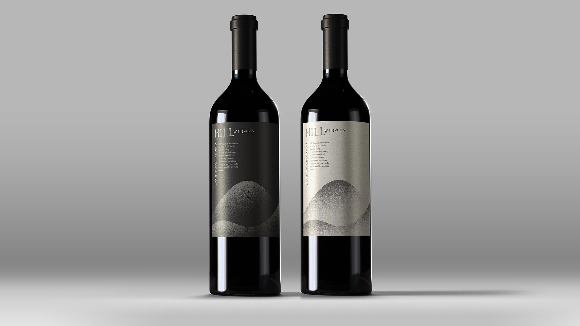
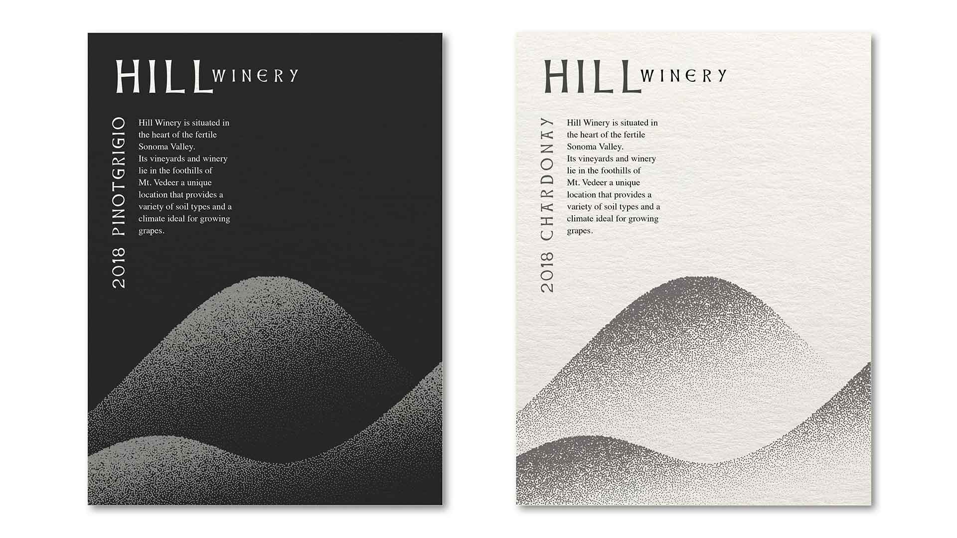
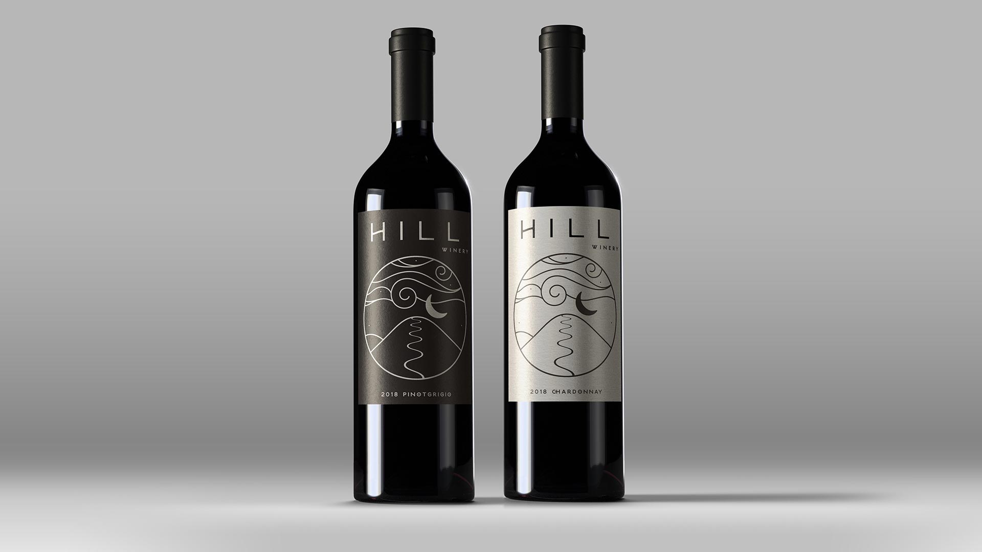
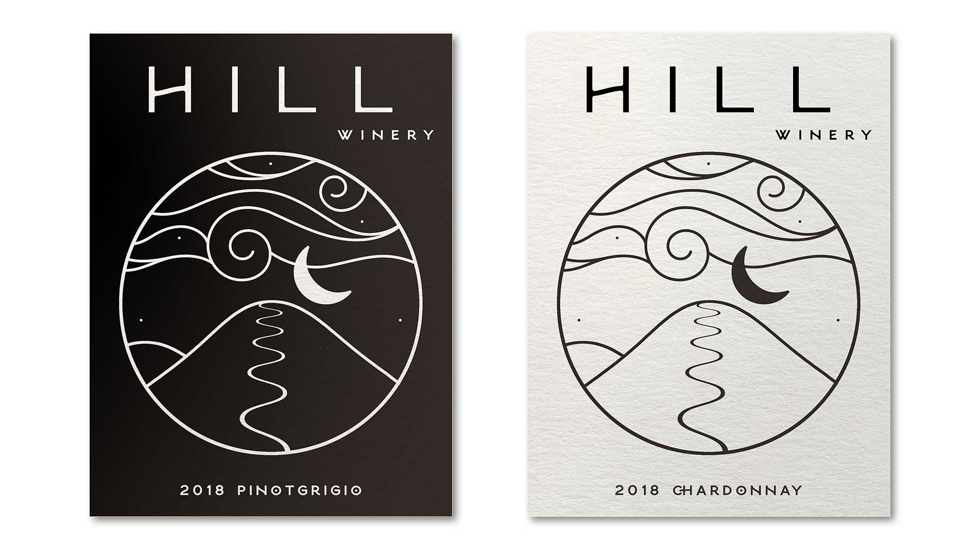
In embracing the branding aspect, Hill Winery sought not merely to convey the quality of their wines, but to encapsulate the essence of their winemaking philosophy and the unique terroir that shapes each bottle. Understanding that a wine label serves as the initial point of contact with consumers, they recognized the importance of creating a visual identity that resonates deeply. It wasn’t just about aesthetics; it was about storytelling. Each label was meticulously designed to reflect the winery’s commitment to tradition, innovation, and sustainability. From the choice of fonts to the color palette, every element was thoughtfully curated to evoke a sense of elegance and sophistication while maintaining a modern edge. Moreover, the incorporation of subtle nods to the winery’s heritage and the Sonoma Valley’s rich viticultural history added layers of depth and authenticity to the branding. Ultimately, the goal was not only to attract attention on the shelf but to forge a lasting connection with consumers, inviting them to embark on a journey of discovery with every sip. Through their collaboration with I Mean It Creative, Hill Winery didn’t just create wine labels; they crafted a visual narrative that embodies the spirit of their wines and invites enthusiasts to become part of their story.


