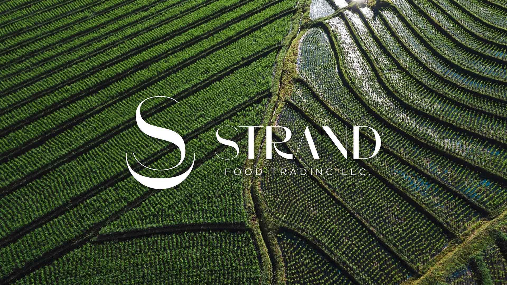
At the heart of this enterprise lies the provision of essential ingredients such as rice, tea, and sugar, with food and its container forming the foundational elements of their identity. Employing a simple yet impactful graphic analysis, I Mean It Creative succeeded in crafting a compelling icon that resonates with the company’s focus.
The newly minted icon is a powerful and memorable representation of Strand Trading’s commitment to providing fundamental food necessities. Its simplicity ensures versatility, making it easily recognizable across various platforms.
Moving forward, the next crucial phase involves the design of the company’s website, where this meticulously crafted icon will play a pivotal role. As an integral element of the online platform, the icon will not only serve as a visual representation of Strand Trading but will also contribute to establishing a cohesive and engaging brand presence.Another key aspect will be its application in print materials, ensuring a consistent and cohesive visual identity in offline communication. Whether on business cards, letterheads, or promotional materials, the icon will serve as a unifying symbol, reinforcing the company’s dedication to essential food exports.
Moreover, the icon will find its place in digital communication channels, including email signatures and social media profiles. Consistency across these platforms is vital in building a strong and recognizable brand presence. I Mean It Creative will ensure that the icon is seamlessly incorporated into these digital touchpoints, contributing to a unified online identity for Strand Trading.
Beyond the icon, the collaboration between Strand Trading and I Mean It Creative extends to the conceptualization of a broader visual language. This language will encapsulate the essence of the company and can be applied to diverse design elements, from packaging materials to marketing collateral. It aims to create a cohesive and harmonious brand experience for both clients and partners.
In summary, the partnership with I Mean It Creative has not only resulted in a distinctive icon but also laid the groundwork for a comprehensive visual identity. Strand Trading’s commitment to providing essential food products is now visually encapsulated, ready to make a lasting impression in both digital and offline spheres. As the company continues to grow and expand its market presence, the newly developed icon will serve as a beacon, symbolizing the reliability and quality synonymous with Strand Trading.