Branding

The concept of security, whether cyber or physical, has always been represented by the key.

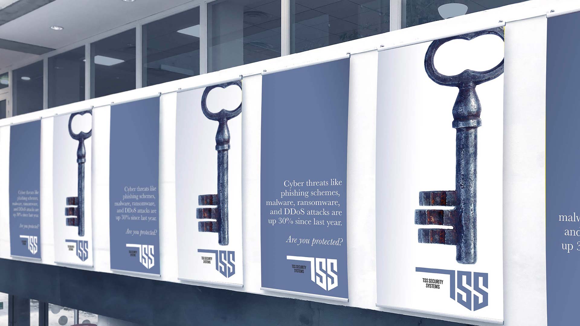
Security only exists where you can lock out unwanted guests. Safe spaces are only safe when those without permission cannot enter.

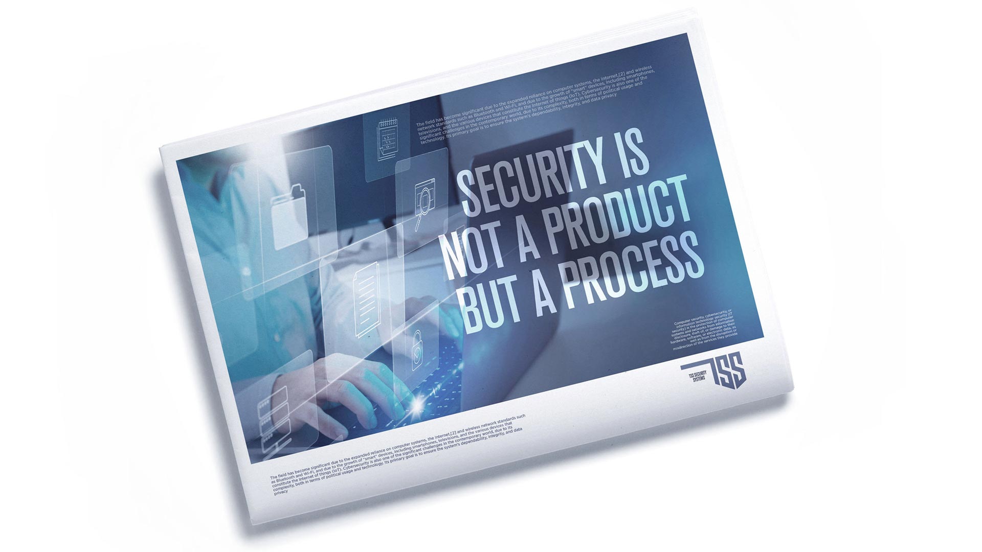
In our modern world, where the multitude of cyber threats increase by 30% year over year, security is no longer achieved with a single, simple key. A range of sophisticated tools are required to keep information—and customers—safe and sound. Security is not a product, but a process. And that process requires experts to build complex systems and cybersecurity packages to protect us from the countless ways our defenses can be compromised.

TSS Security is one of those experts building the tools that keep us safe. They came to I Mean It Creative with the aim of creating a consistent and familiar-feeling corporate identity. We started by crafting a beautiful new logotype designed to evoke the shape of a key. It’s instantly recognizable while eliciting an immediate feeling of security. It’s memorable in its simplicity and in its bold lines and sharp edges. It takes a centuries-old icon and gives it a modern twist. Most importantly, it’s easy to read, so the company’s name isn’t lost in the design.

With the logo locked down (pun intended), I Mean It Creative went on to design a full corporate identity for TSS Security that would cover all business uses. We utilized a calm blue tone that conveys peace of mind and a sense of ease. The applications for these designs are limitless, including product packaging, company vehicles, printed materials, merchandise, business cards, and more.