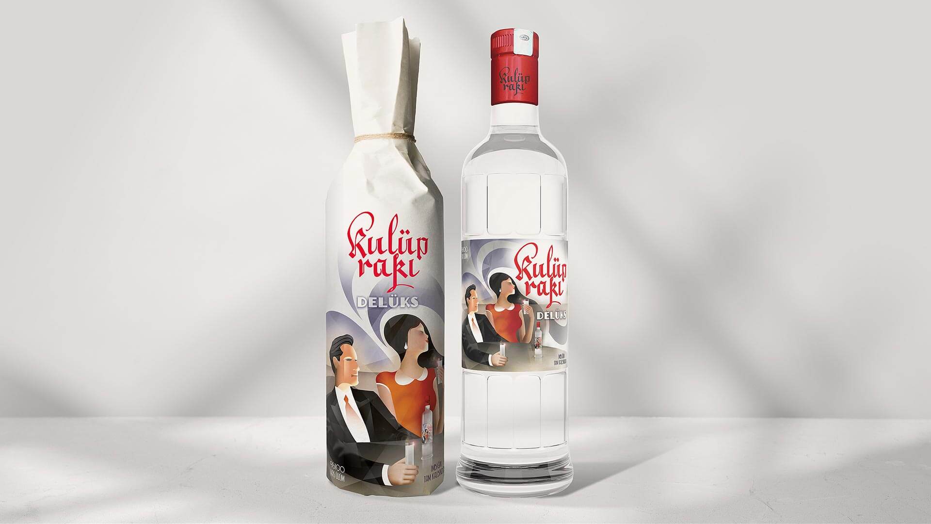
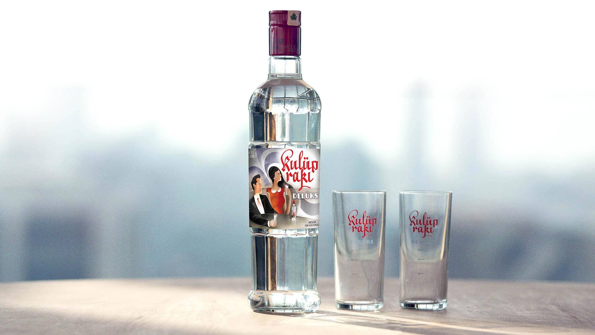
The design of the iconic label by İhap Hulisi Görey in 1936 has a historical significance, contributing to its emblematic status. To bring the vintage raki brand into contemporary times, Emrah Yücel was commissioned to execute the packaging design for a modern adaptation of Mey Diageo Kulüp Rakı.
This particular edition, titled Deluxe, aimed to evolve Kulüp Rakı while preserving its iconic design. The initiative to diversify raki, particularly since the shift from Tekel to privatization over the last three decades, has notably increased women’s engagement in raki consumption and their influence on various products. This shift, reflecting the presence of women at raki tables in taverns and social settings, inspired the concept behind Kulüp Rakı Deluxe.
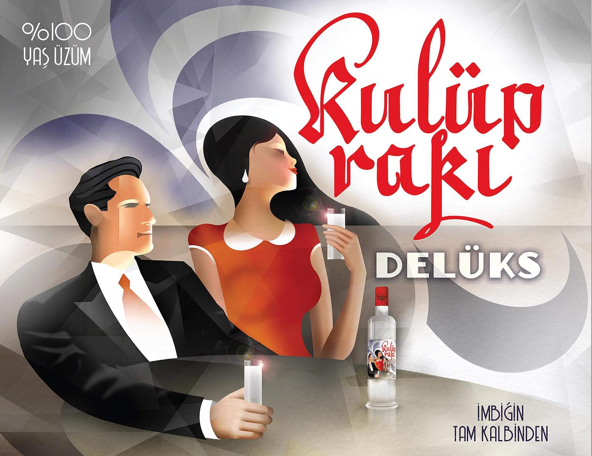
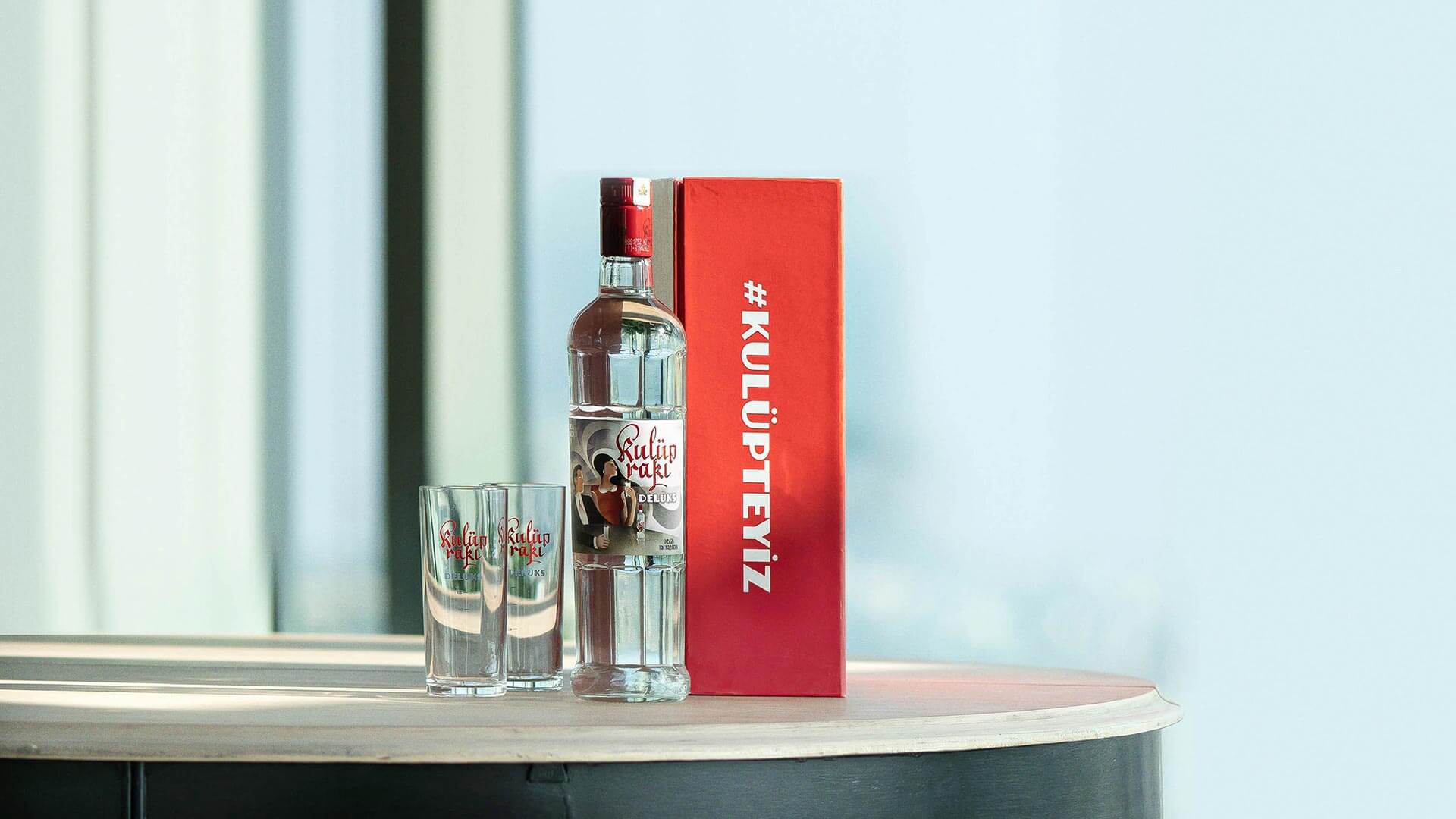
Taking cues from the original label’s table setting, featuring İhap Hulüsi Görey and a friend, the reimagined design was crafted to incorporate a female figure in a contemporary context at the center of the label, while respectfully nodding to the original label’s essence.
The new label, crafted in the art deco style unique to its era and reminiscent of the brand’s origins, marked a groundbreaking move, introducing a female figure savoring raki on the bottle—a first for raki branding.
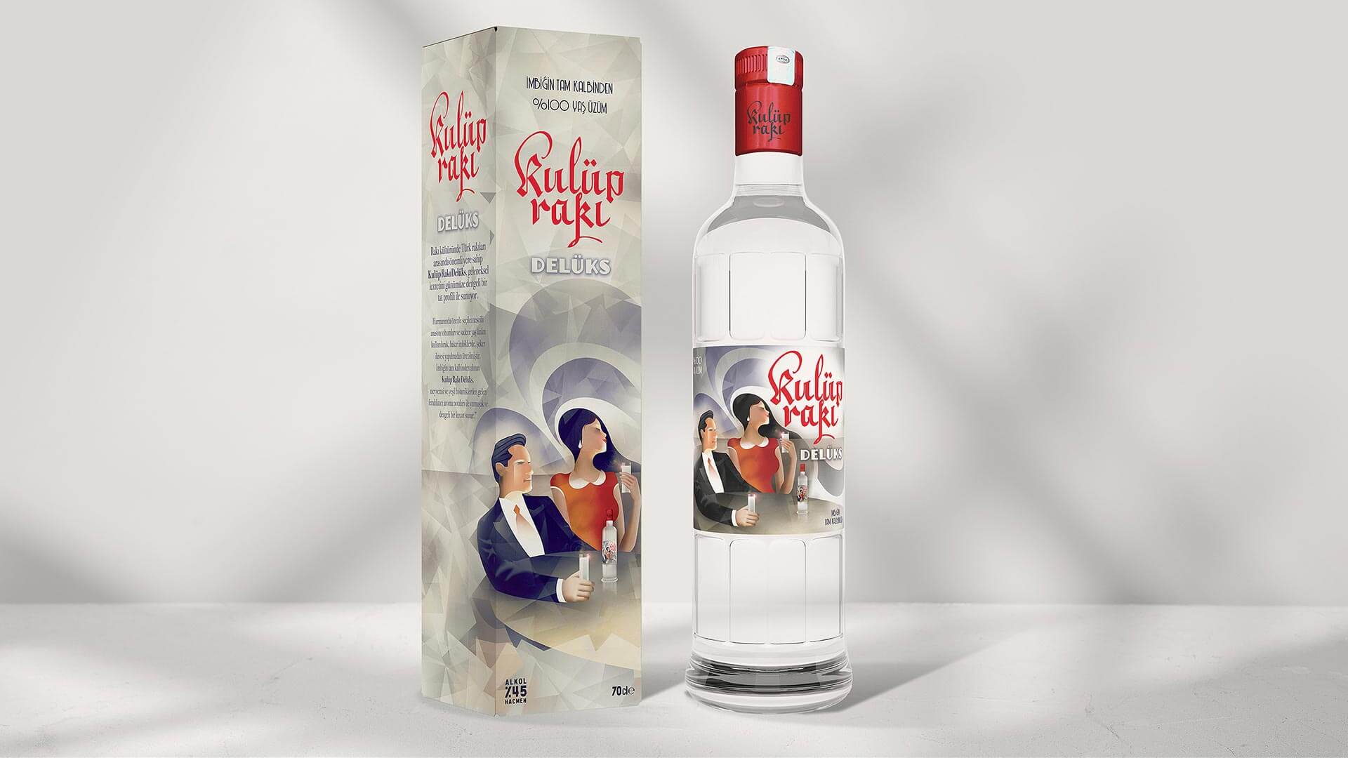
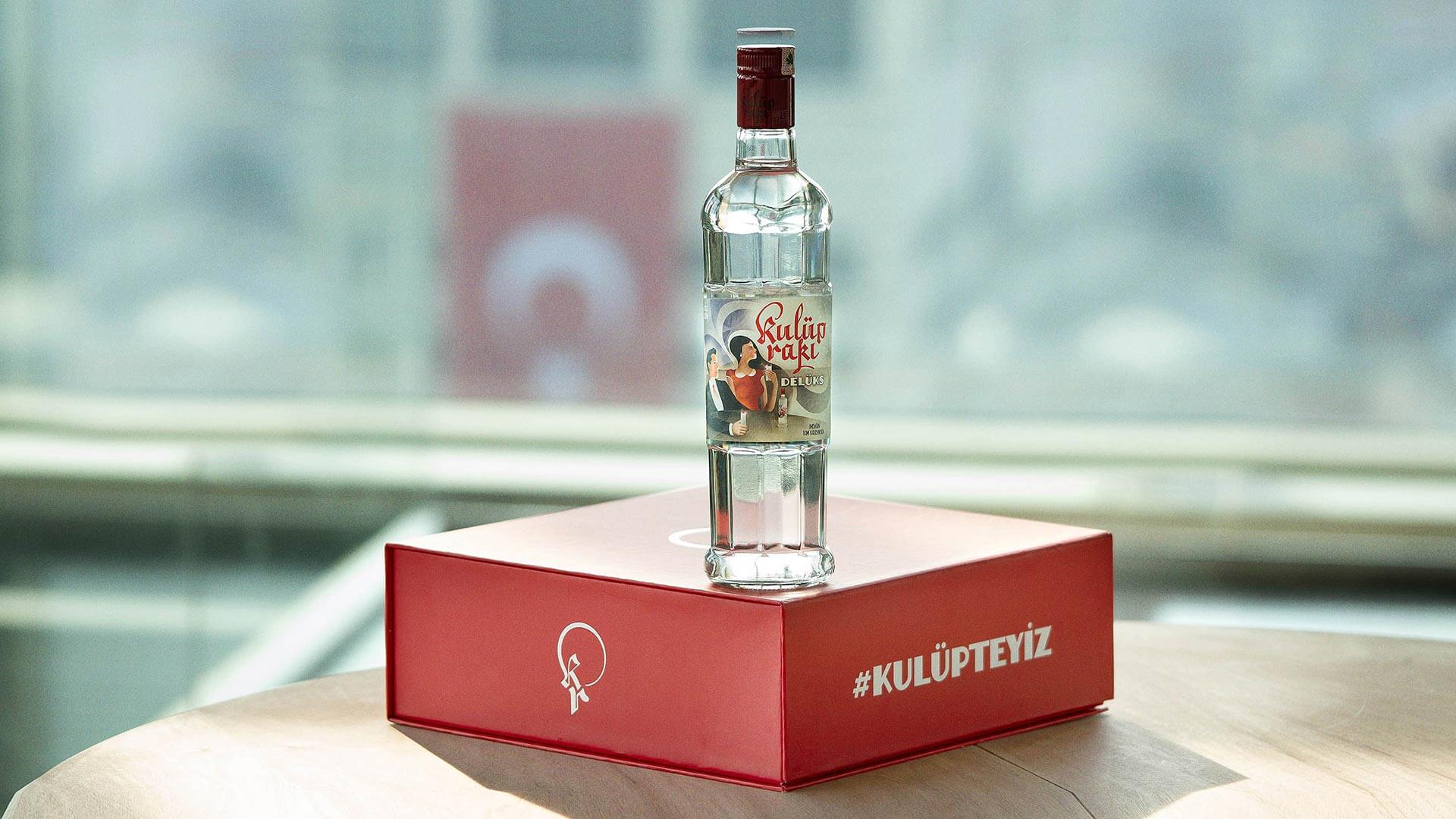
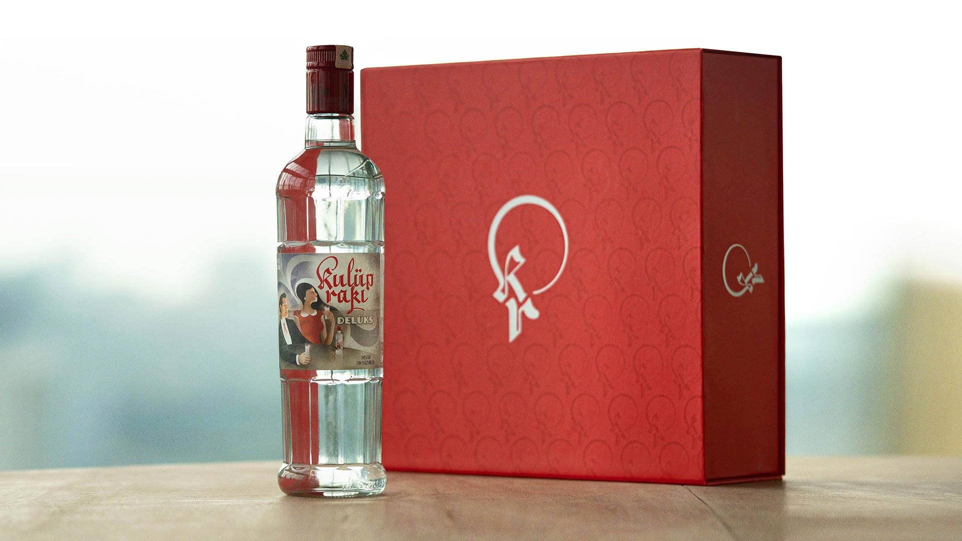
In tandem with the approved design, I Mean It successfully developed various communication materials essential for the brand, covering secondary packaging, dark market promotions, and the deployment of service materials.
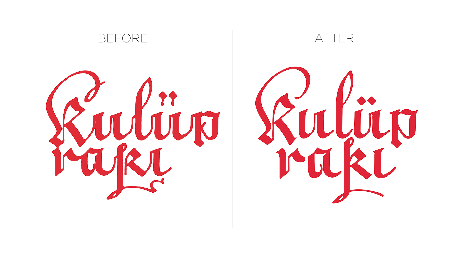
Regarding the Kulüp Rakı logo, which has engraved itself in the public’s consciousness over its almost 100-year history, an inevitable change was introduced with the Deluxe version. A revised version was created, maintaining the logo’s essential features while enhancing readability.
The font chosen for the Deluxe font belongs to the art deco world, capturing the essence of the era’s spirit.
The redesign implementation covered a spectrum of communication elements required by the brand, ensuring that its secondary packaging, dark market applications, and service materials carried the revamped essence of Kulüp Rakı Deluxe.