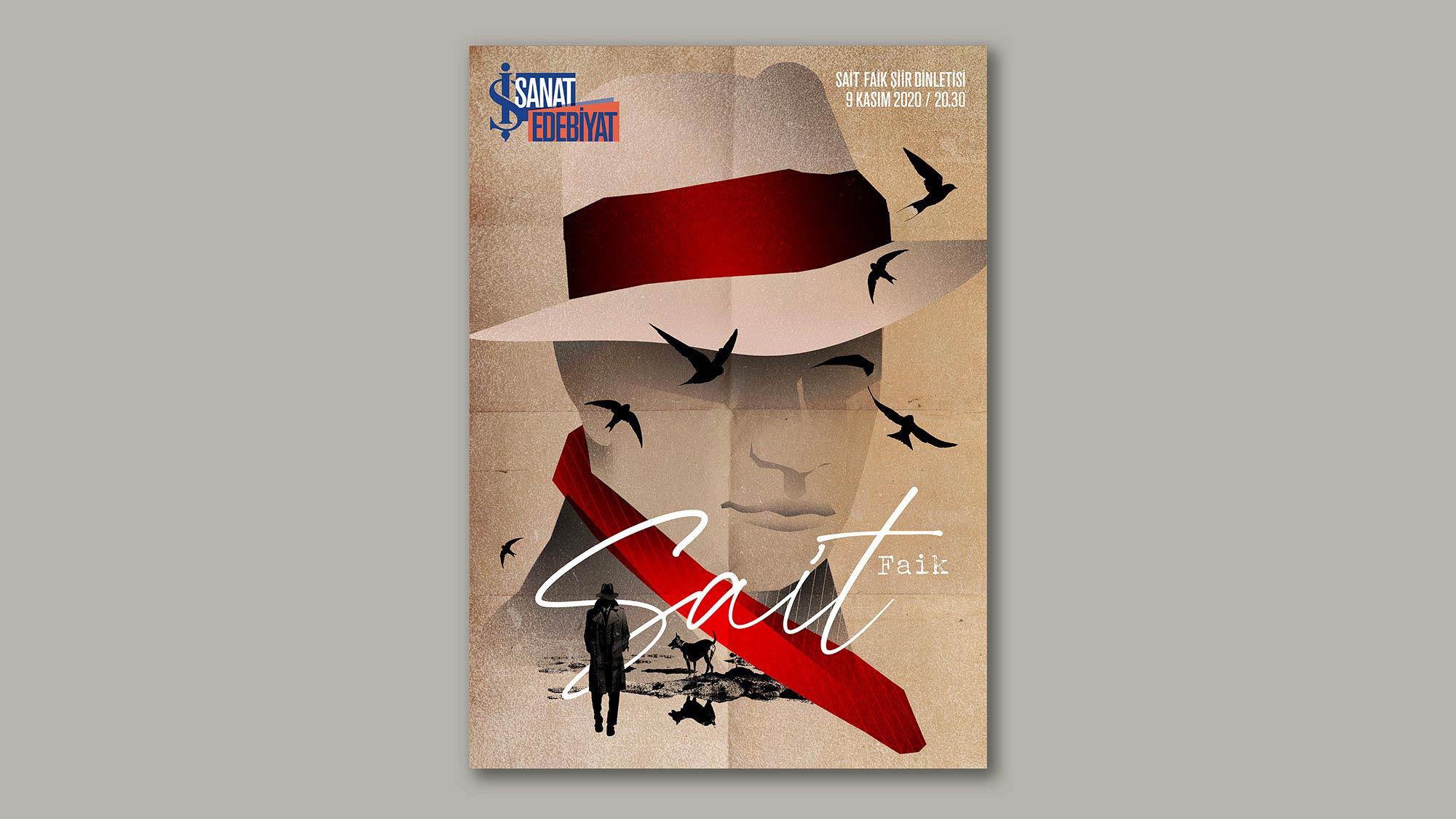
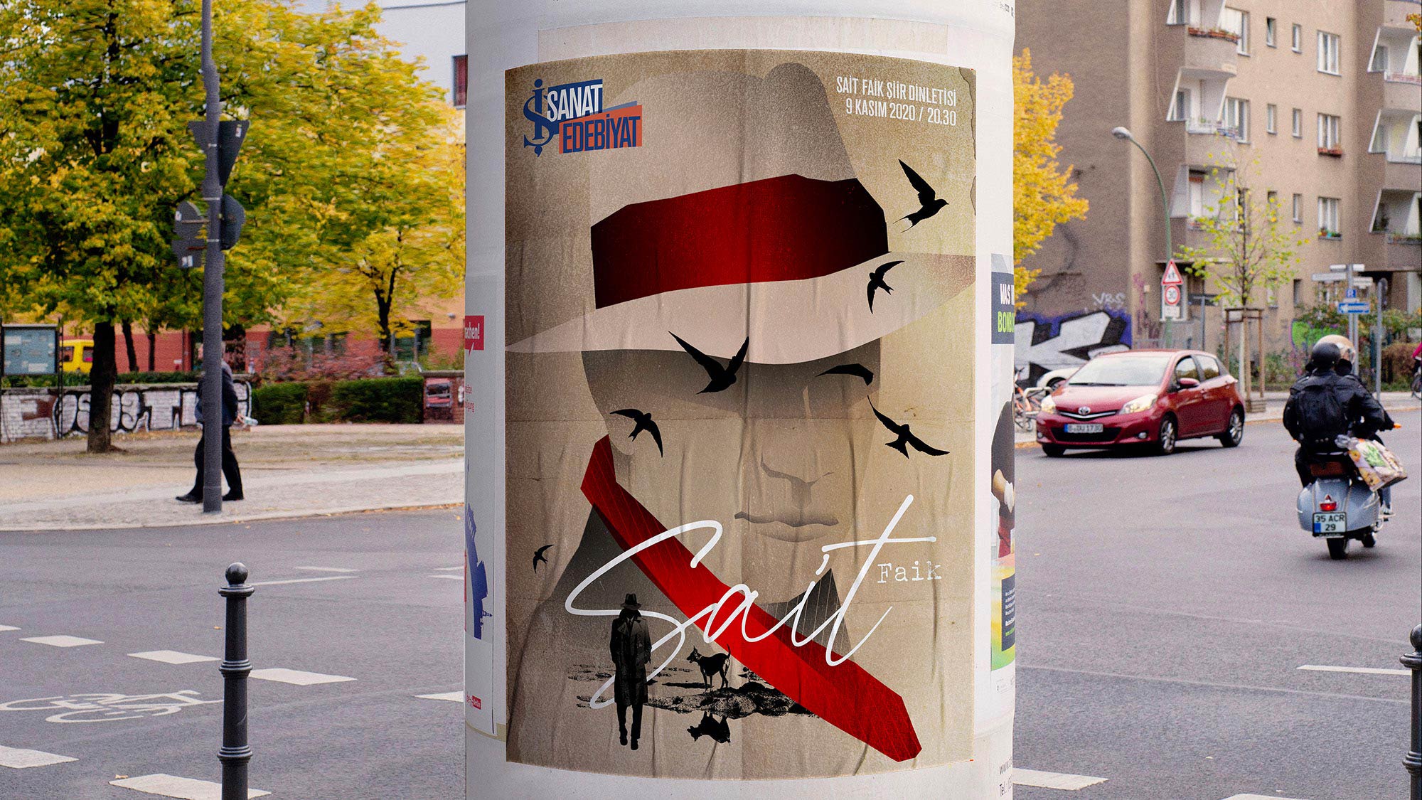
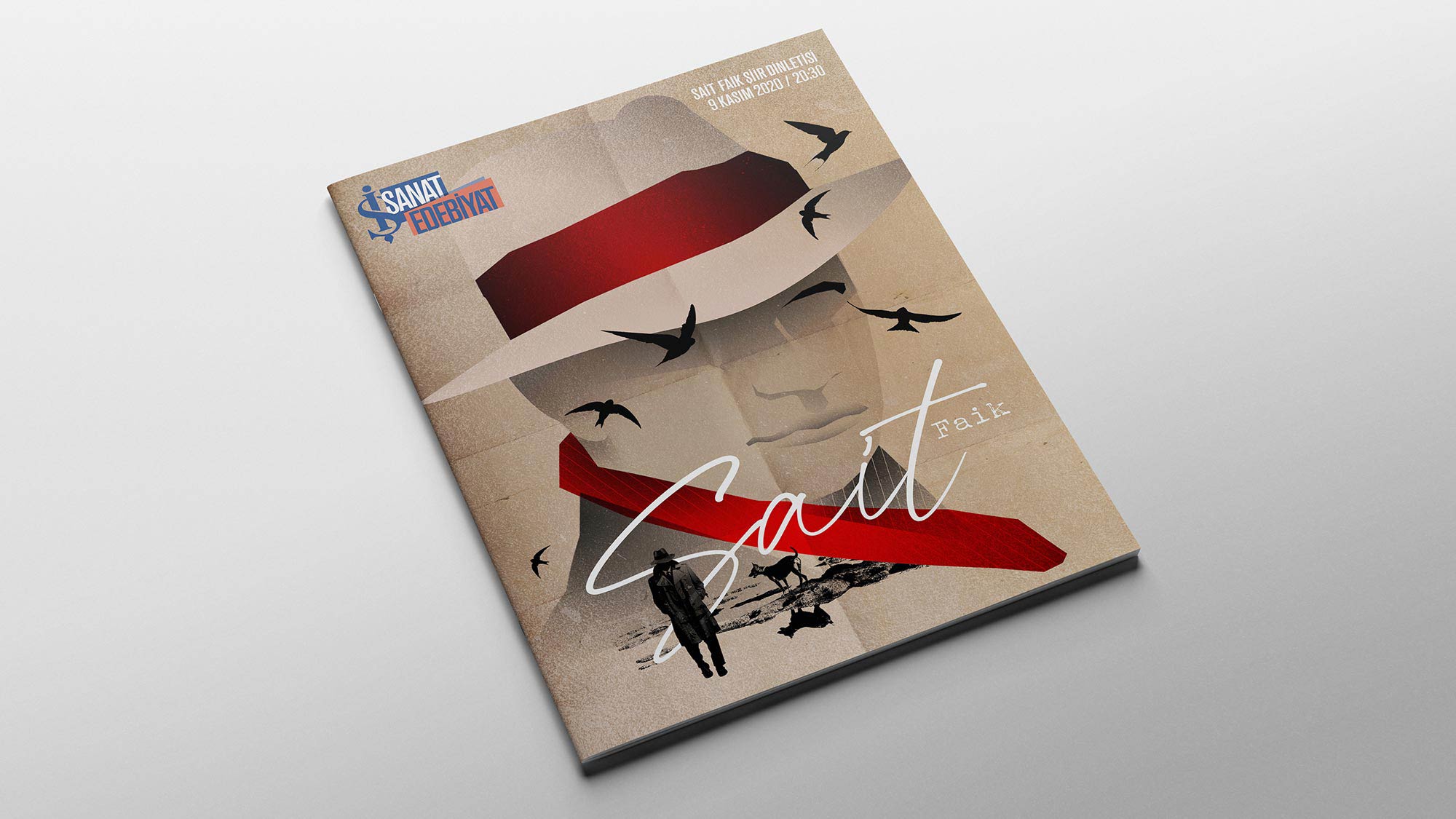
The branding we created for İş Sanat last season consists of a modular structure that uses colors to identify the artistic discipline relating to each event. The branding for the literature events, which is identifiable through the signature orange-colored literature logo, ensures coherence for the entire series, while still allowing for each event to have an individual key-art.
This event, which was a reading of Sait Faik’s poems, was both marketed and performed digitally. Bringing new life to Turkish short story literature with his humanistic depiction of those at the bottom of the social hierarchy, Faik wrote stories that focused on urban life.
Working with the same color palette used in the key-arts of the other events within the literature series, we used motifs like Sait Faik’s famous hat, and the Seagulls synonymous with the Bosphorus.
In addition to creating an iconic key-art, we also adapted the key-art into a dynamic short video that can be used as a promotional trailer across social media platforms.


