City Branding for Bergama City

Bergama walks the fine line between an “antique city” and a “living city”, which distinguishes it from other historical destinations.

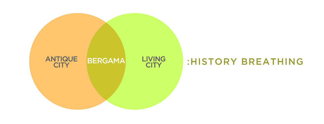
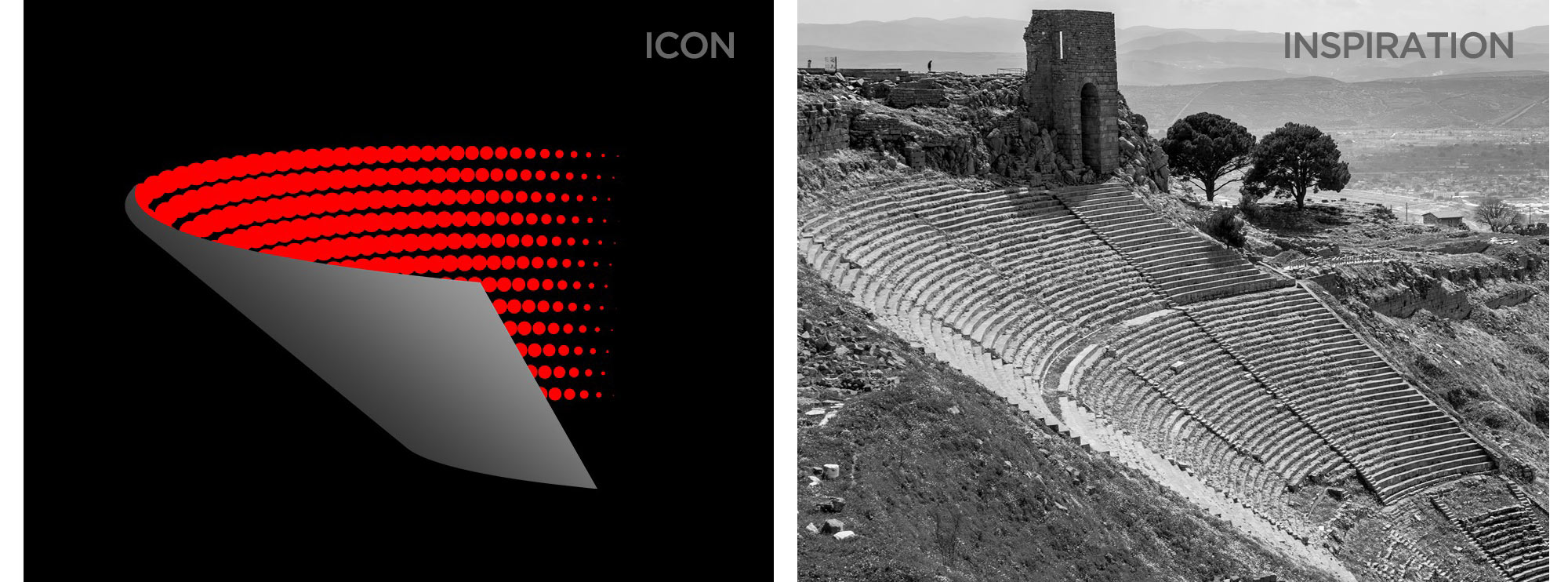
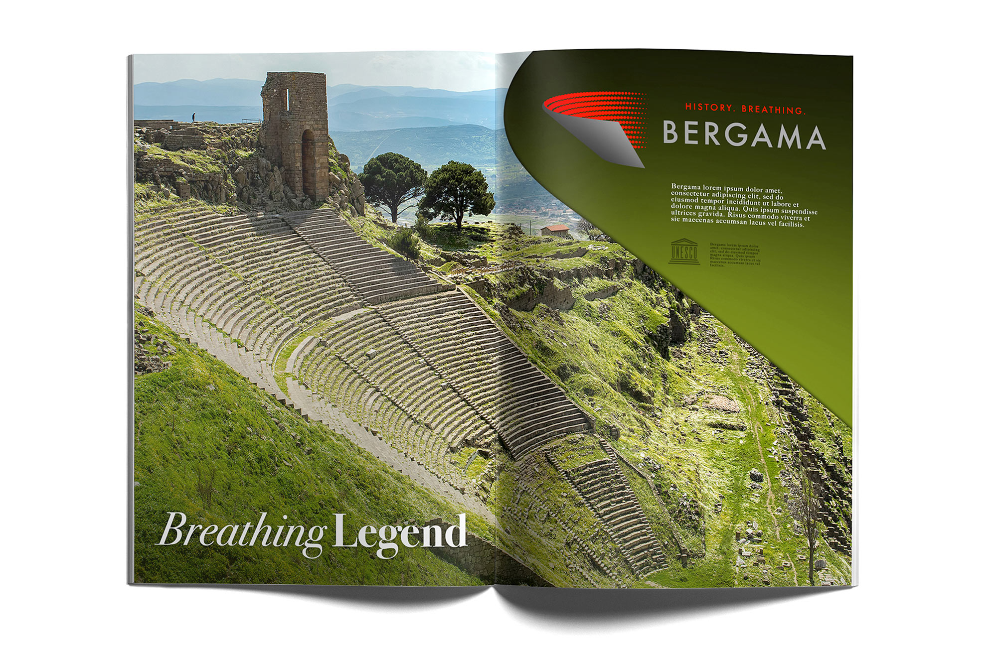
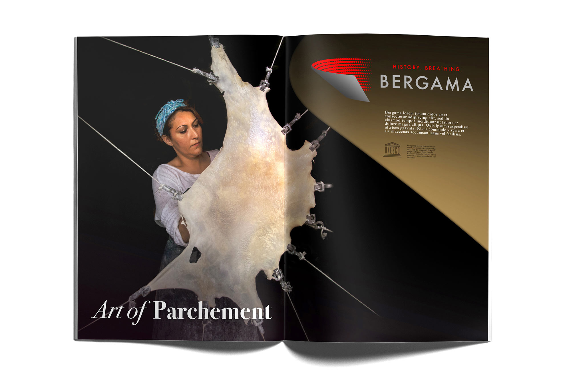
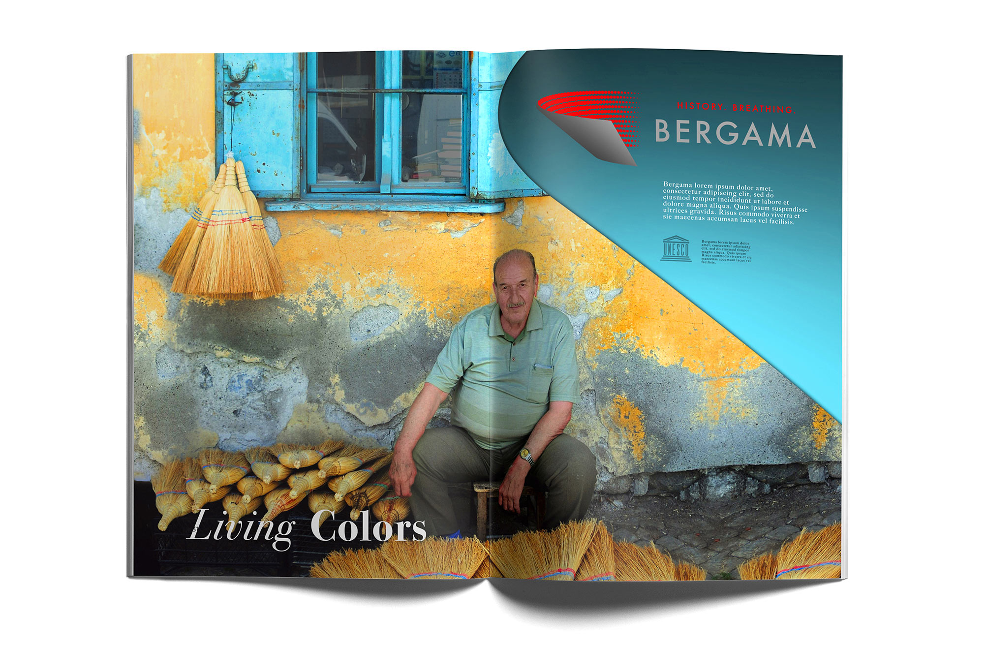
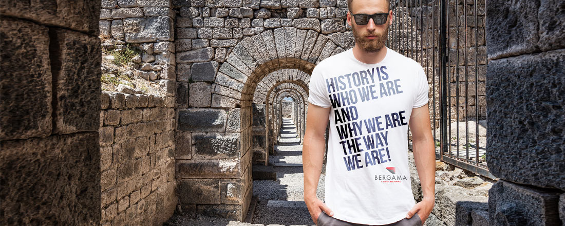
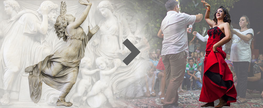
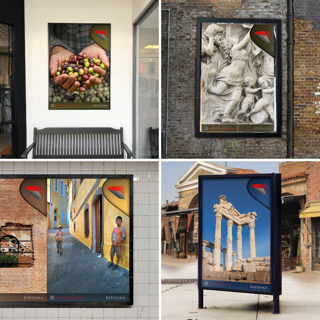
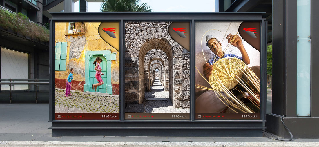
A place that traces back 3,000 years, at a time when the earliest civilizations were beginning to form. Also known by its historical name, ‘Pergamon’, the city is part of Unesco’s World Heritage List.

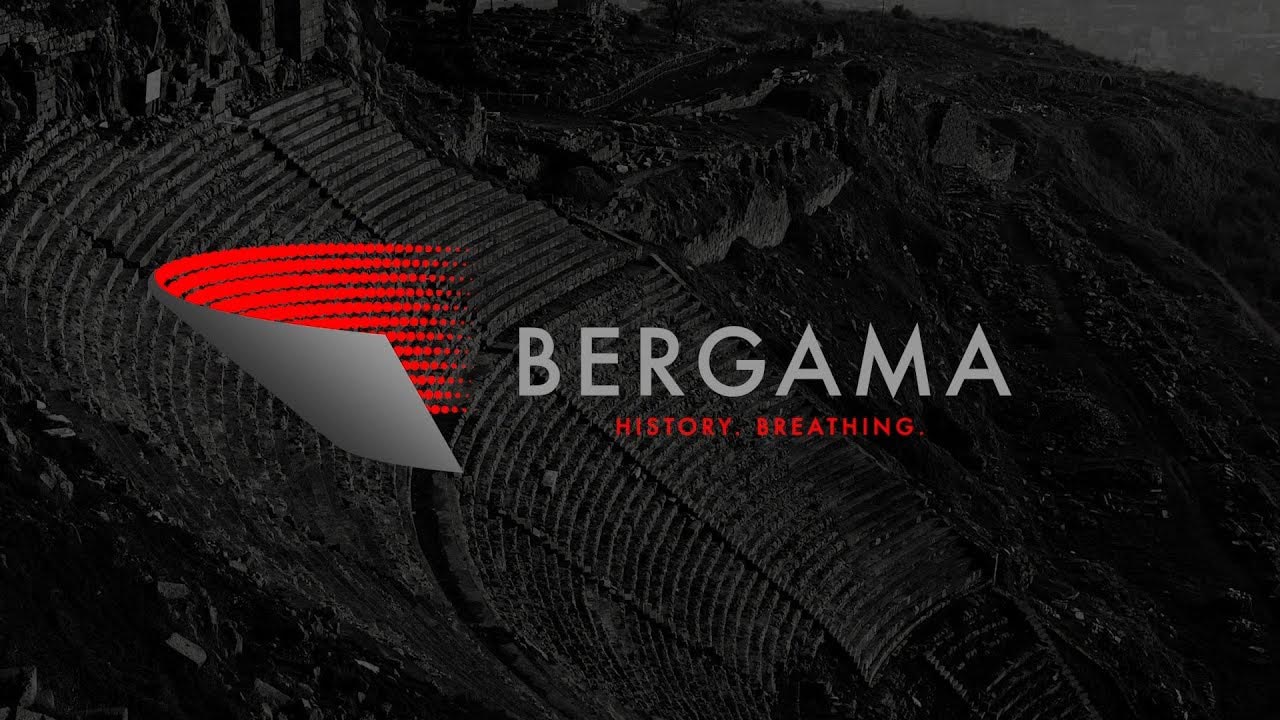
In 2019, I Mean It Creative had the pleasure of assisting Bergama with its city branding needs. To produce a marketing approach befitting this antique city, we used a two-phased method. Phase One was about research, analysis and planning. Phase Two was about strategic expression and creativity.

During the first stage, we reviewed strategic reports and relevant analysis. We identified the current tourism trends and conducted extensive interviews. Throughout our extensive campaign, we gathered in total the views of almost 700 people. With all this information, we created a “Map of Values” for the city.

Based on our surveys, we found one common value: the history of Bergama.

This led us to the second stage of our work, where we determined the factor that distinguished Bergama from other ancient cities.

Bergama walks the fine line between an “antique city” and a “living city”, which distinguishes it from other historical destinations. Eventually, this realization helped us brainstorm our slogan: “Bergama: History Breathing”.

Next, we created a visual for this new brand based on a unique architectural structure within the city: the amphitheater – the most important platform throughout history where democracy and the people of the city come together. This particular stadium also happens to be the steepest theater in world history.

This amphitheater, where the people of Bergama have gathered for the past 3000 years, is the city’s most important landmark, and a place that provides the locals with a sense of belonging. As such, it became the perfect symbol for the brand identity of Bergama.

This abstraction inspired us to create other materials which we used in various areas of the city’s branding. Horizontal layouts were used for marketing materials in publications, and vertical formats were printed for use in the city center, fairs and other outdoor advertisement spaces.

We then expanded our Visual Identity with color codes and different applications, designing gift items such as canvas bags, a variety of t-shirts and local products for usage in store.

CASE STUDY

ÖRNEK İNCELEMESİ