With a company history that spans a century, Turkish personal care brand Eyüp Sabri Tuncer is about as iconic as a brand gets. How do you guide a classic company’s identity toward the future while staying true to its storied past? I Mean It Creative took on the challenge to position Eyüp Sabri Tuncer as both a modern brand and a historic beacon of staying power.
Rebranding
Even the most iconic brands need a facelift from time to time.
When updating Eyüp Sabri Tuncer's look, I Mean It Creative took advantage of new, cutting-edge printing technology, while ensuring the rebrand would translate equally well to the digital realm. We are, after all, living in a digital world — even a company as classic as Eyüp Sabri Tuncer needs a modern edge.
In order to give Eyüp Sabri Tuncer a contemporary upgrade while respecting its hundred-year history, I Mean It Creative closely examined how the brand’s visual ID evolved across its decades of existence. We found inspiration from design elements that originated all the way back in the 1940s, but the look needed a refresh.
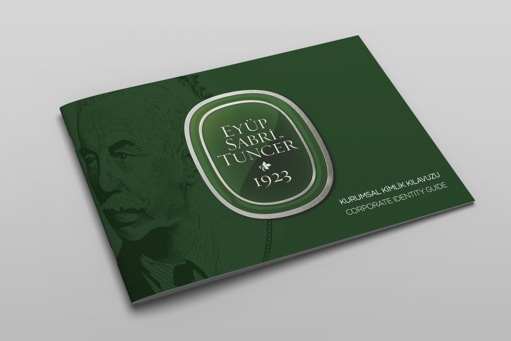
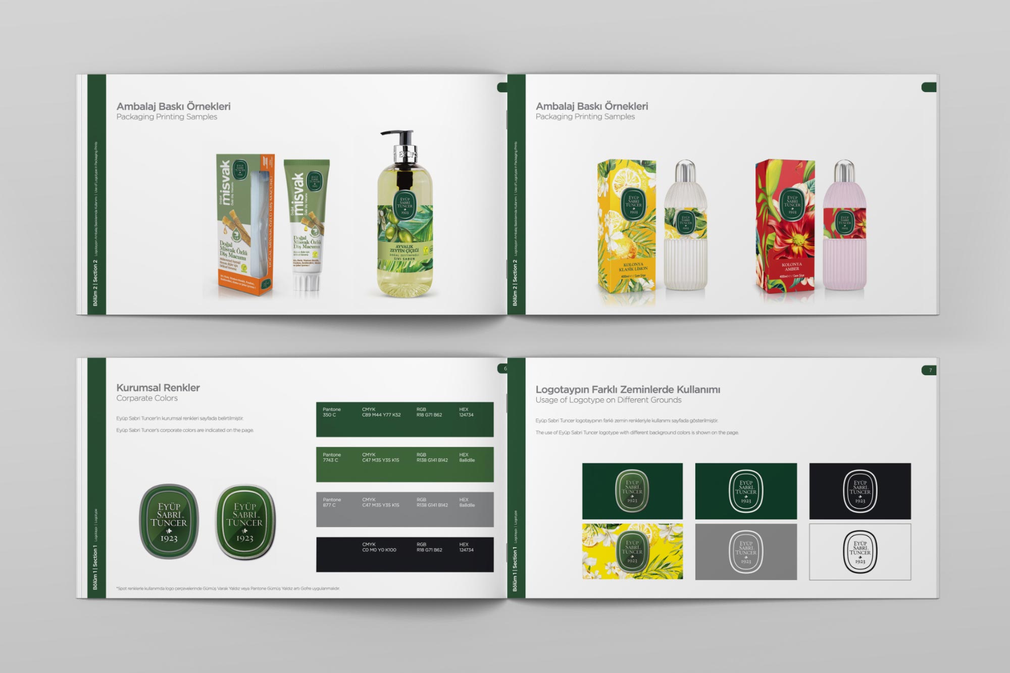
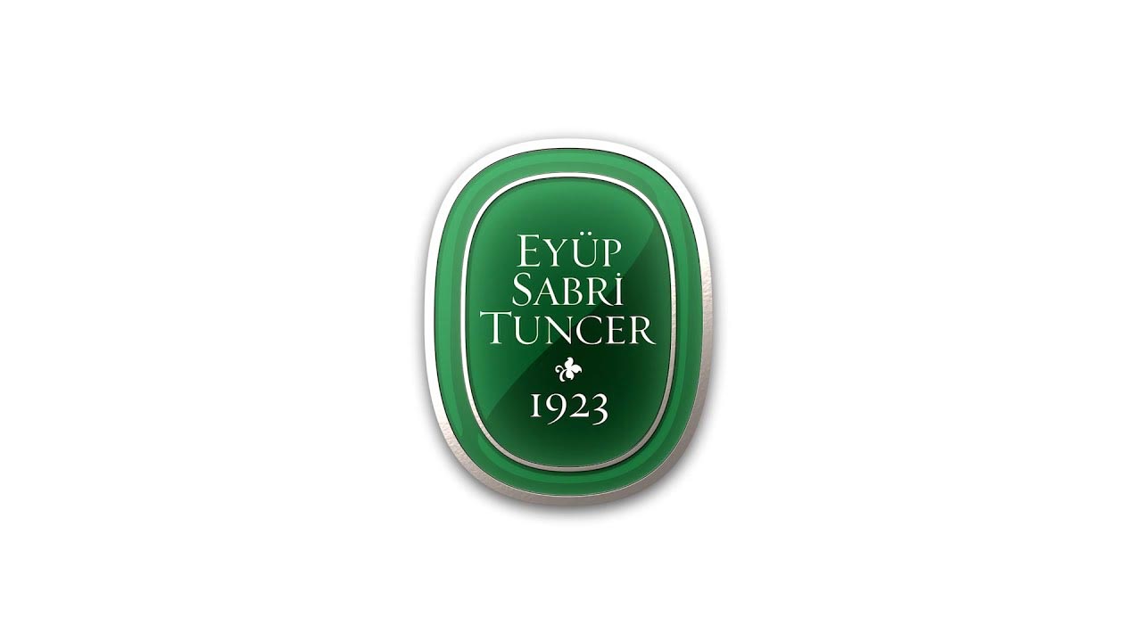
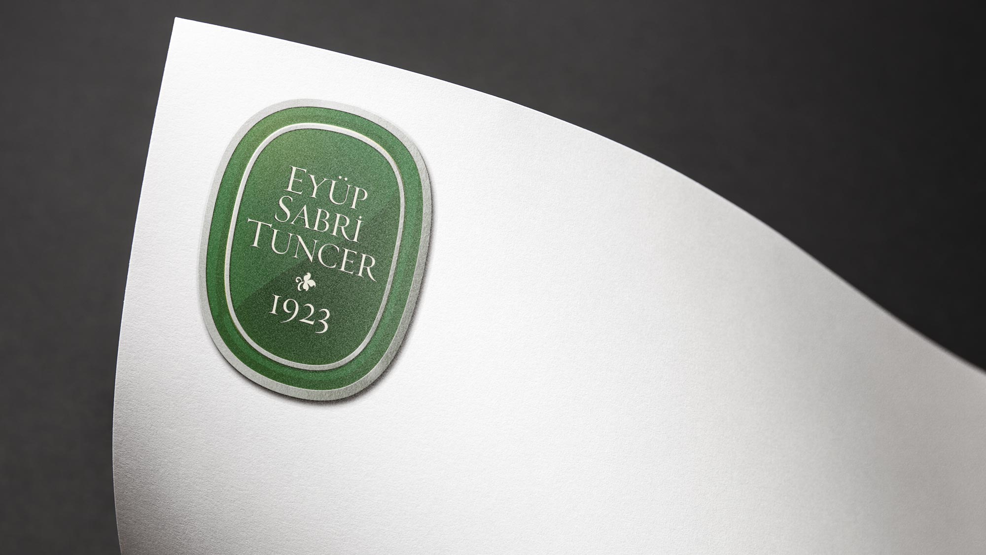
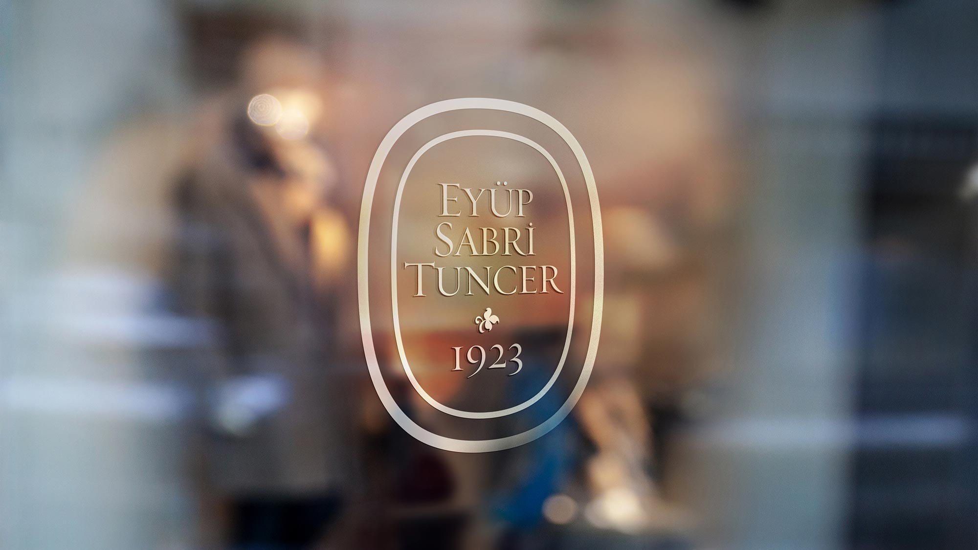
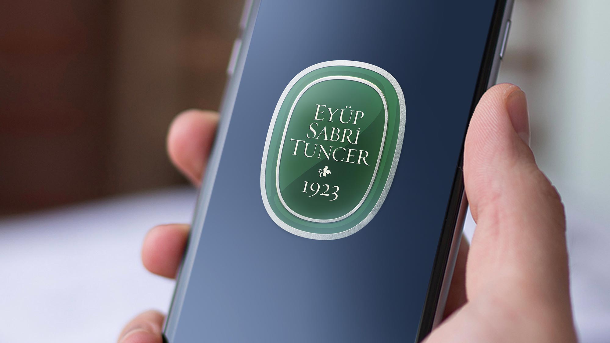
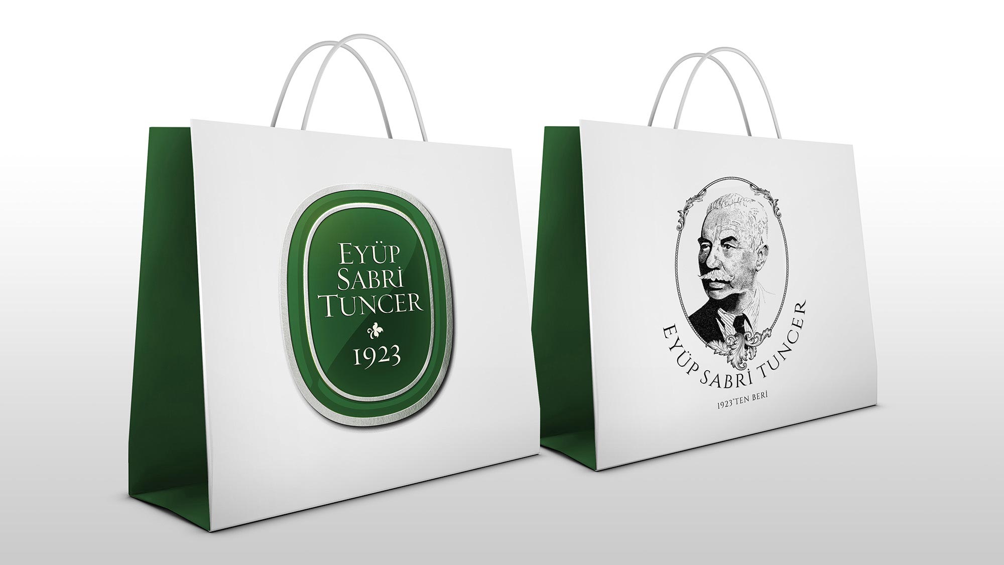
For the primary logo, we took the current design and rounded out the edges as a nod to the ’40s-era logo. This resulted in a beautiful badge shape with a classic-yet-contemporary look. We then updated it further with a three-dimensional texture and a beautiful, eye-catching silver border. In print, the border sparkles and shines as though it were printed in metallic ink. The distinguished new logo design positively leaps off the page (regardless of whether the page is digital or print).


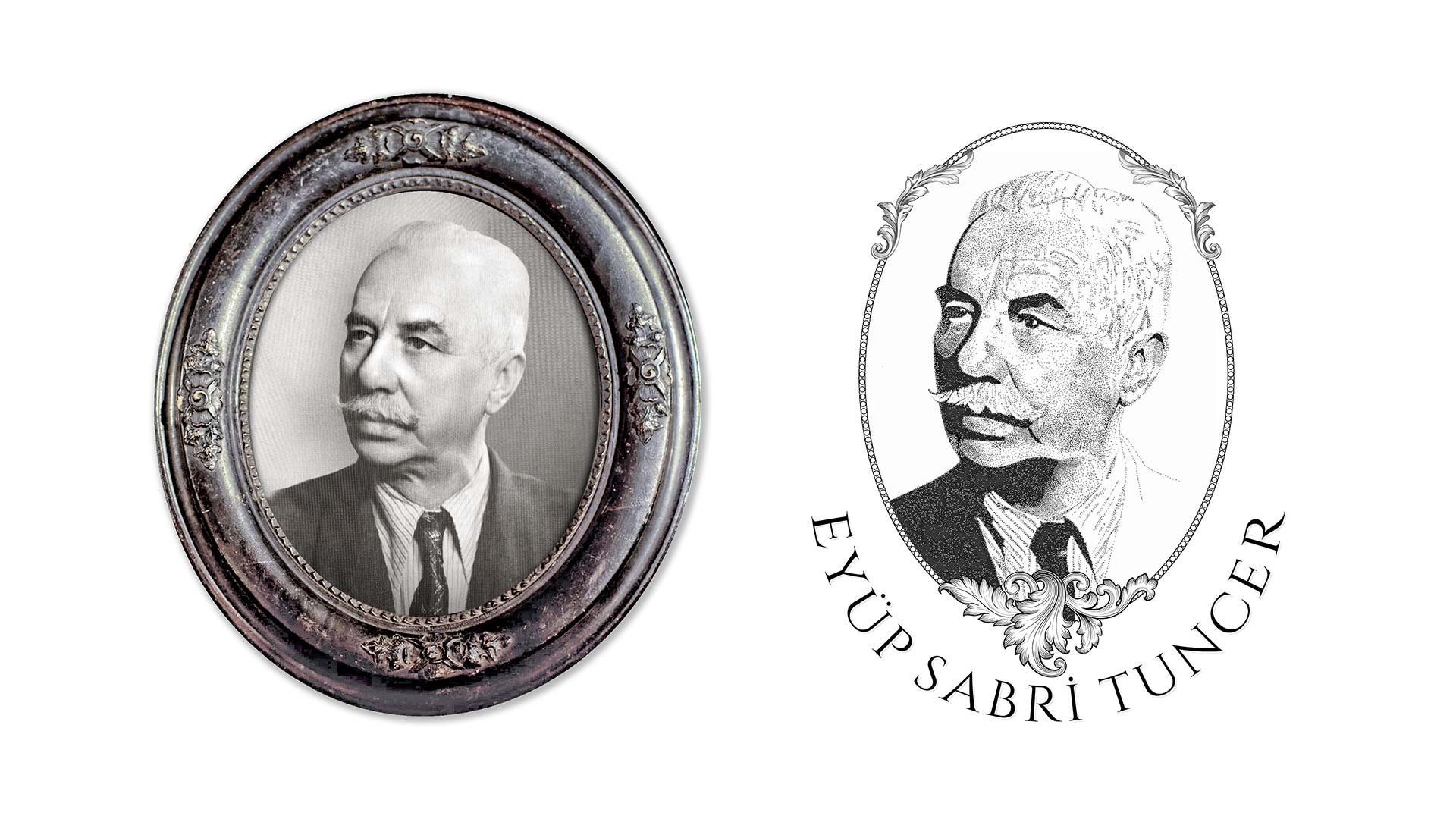
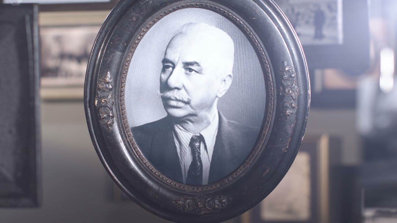
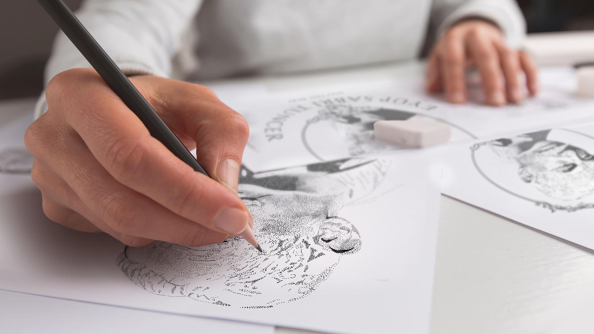
I Mean It Creative knows how important a face can be for brand recognition. Although the Eyüp Sabri Tuncer brand is a hundred-year stalwart, we realized there's always been something missing: Tuncer himself! To remedy that, we designed a secondary logo that would finally put a face to the longstanding name brand. Using a stately, vintage photograph of Tuncer as a source, we created an alternate oval badge. This one frames an instantly identifiable face, artfully fashioned in a pointillism style.
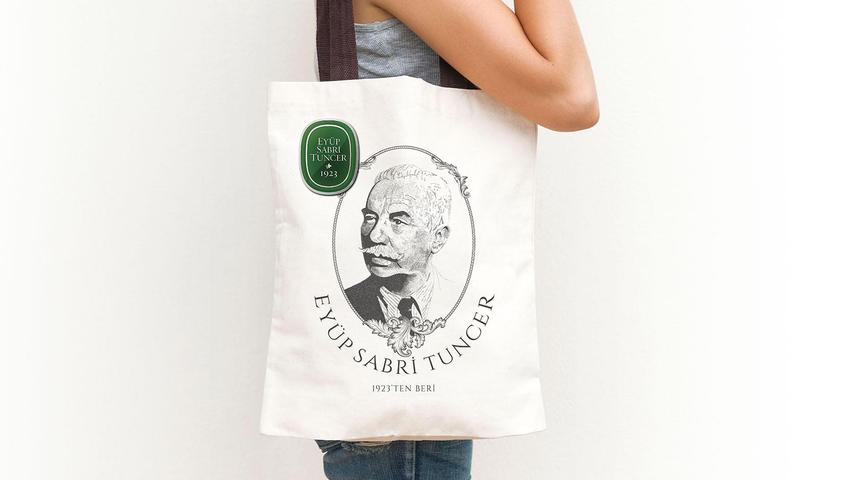
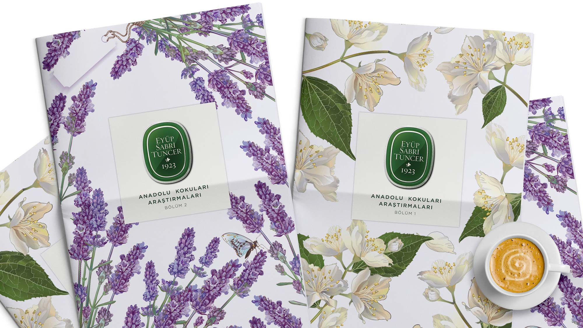
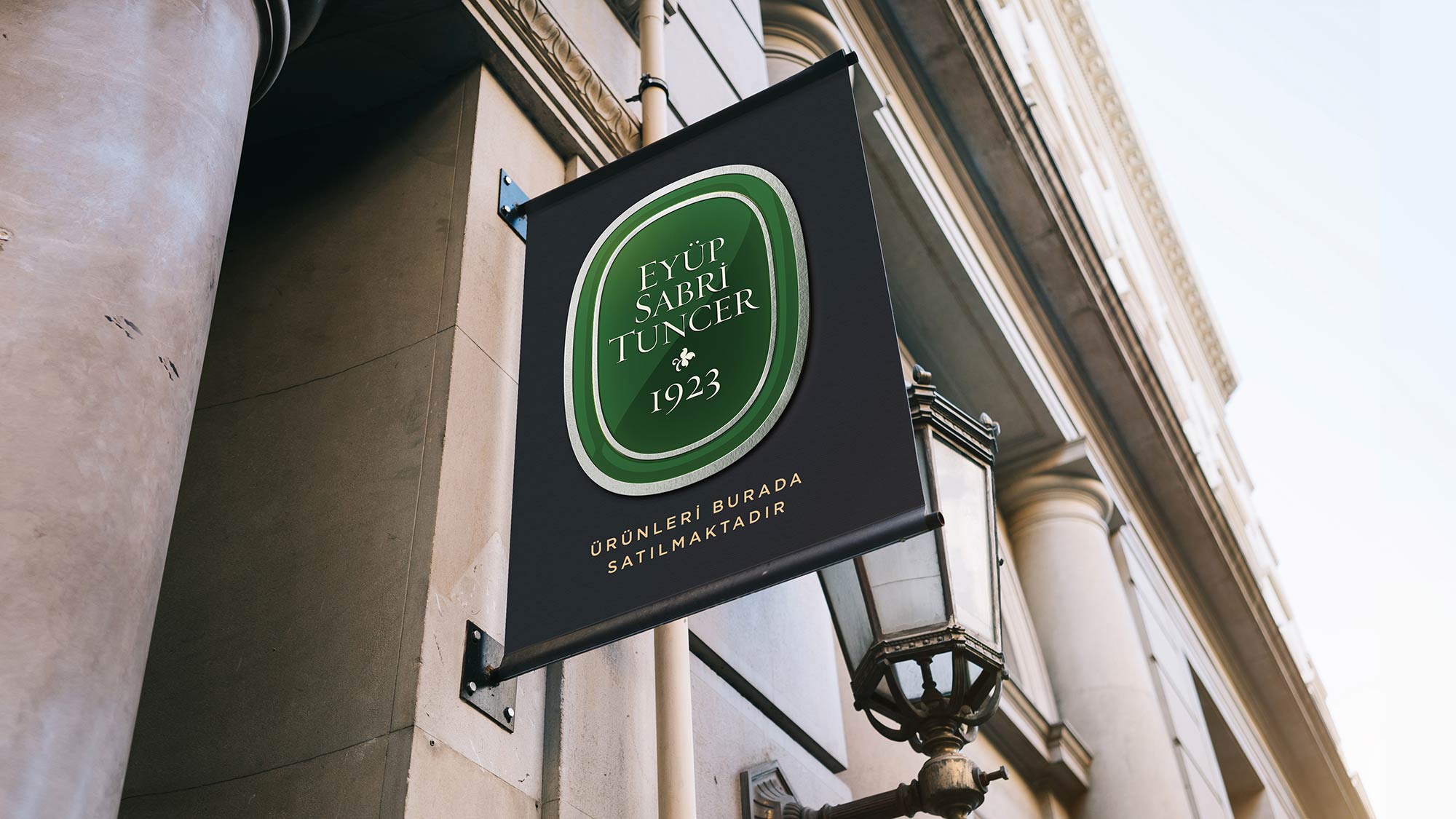
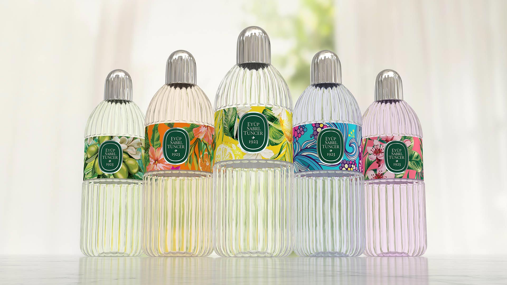
With the logos sorted out, we were off to the races to create the rest of Eyüp Sabri Tuncer's exciting new look. From product packaging and websites to street signs and merchandise, consistency is of the utmost importance when it comes to brand management.
With that in mind, I Mean It Creative set to work compiling a definitive Brand Bible for Eyüp Sabri Tuncer. Establishing color schemes, logo placement and other branding best practices, the corporate identity book ensures the look and feel of the company will remain invariably recognizable no matter where it appears.
A familiar brand is a strong one. With this modern classic rebranding, I Mean It Creative crafted a company identity that commands attention. Eyüp Sabri Tuncer has an incredible history. We’ve done our part to be sure it also has a promising future.