Channel Identity

D-Smart is a Turkish satellite television provider that has around 1.6m subscribers. As a digital platform, it had been increasing the quality of its sports content steadily. That said, the brand was not enjoying the level of brand awareness that it deserved. To solve that problem, D-Smart hired I Mean It.

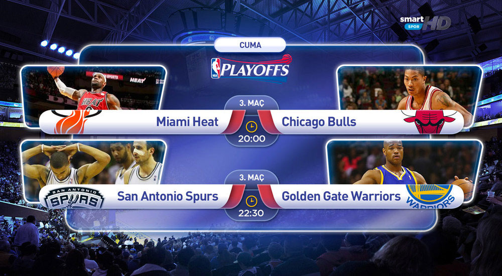
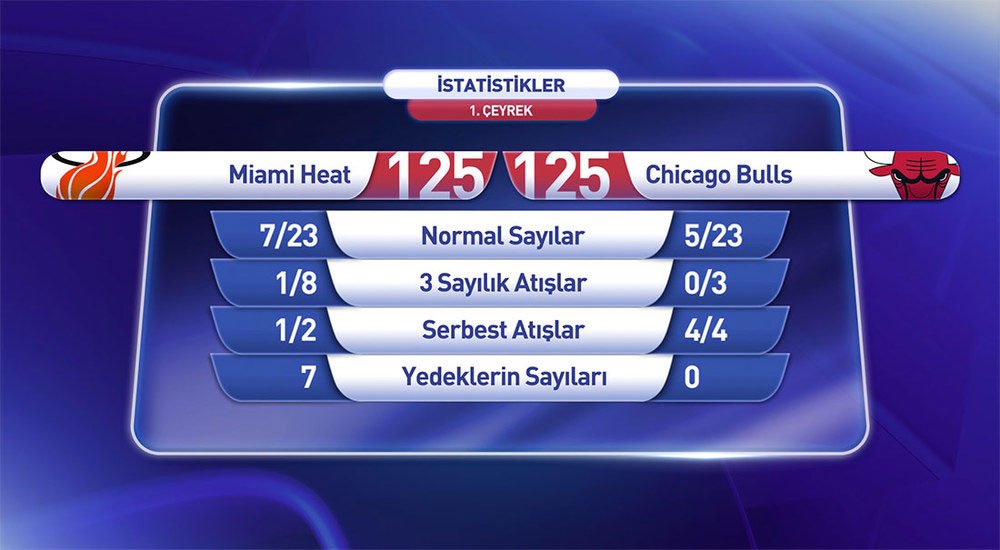
SPORTS CHANNEL IDENTITY

D-Smart had dozens of sports content, but very little visual hierarchy. The logos were neither telling a holistic story nor projecting a cohesive image. So, we decided to start from scratch. We completely overhauled the visual hierarchy of the sports channels. Then, we redesigned every channel’s logo. The result was an improved hierarchy, which helped the viewers better navigate through sports channels.

MORE PROFESSIONAL, MORE EXCITING…

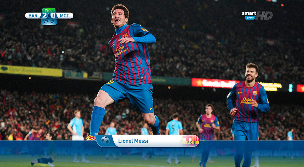
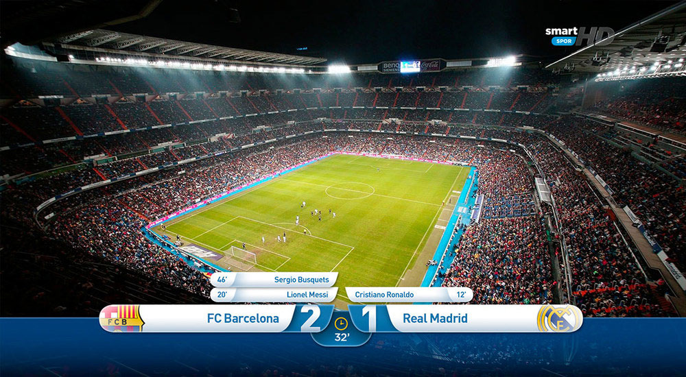
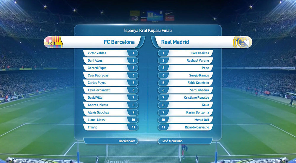
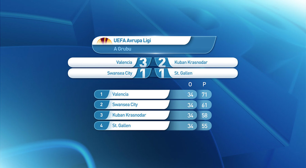
Prestigious sport events, such as The Champions’ League, UEFA Europe League, NBA and F1, always raises the quality bar of screen visuals. A digital platform that airs such big competitions should be able to compete with their identities in terms of design quality.

With its smart solutions that make the screens much easier to understand and its design that follows the latest creative trends in the world, the sports channel identity set we created for D-Smart offers a more professional looking, more exciting look for the sports enthusiasts.

CHANNEL ID BRANDING

I Mean It re-visioned the brand’s digital visual hierarchy, creating a more modern, and friendly interface.

D-Smart had hundreds of channels, each having an entirely autonomous look. Previous design overlooked the need for having a visual hierarchy. Moreover, there was no cohesion regarding the nomenclature of channels. Unnecessary visual details existed while some fundamental identity components were missing.

We completely overhauled the visual hierarchy of D-Smart, which was both confusing, and misleading. We started by renaming ten channels to strengthen the brand hierarchy. Then, we redesigned more than 60 channels’ logo. Finally, we created new branded animations for themes such as “breaking news,” “commercials,” and “upcoming program.” The result was a sleeker look and a more attractive brand.