Pharmadeal is a system that works to ensure that every American citizen has access to safe medicines at affordable prices. It is one of many similar structures serving in similar system, which is defined under the name of ‘Canadian Pharmacy’ in the USA.
I Mean It Creative has been hired by Parmadeal to create the Name and Brand Identity of this system. Naming, which is one of the most important steps of branding, is an increasingly difficult field, especially in this period of ‘Domain Wars’.
“Pharma-deal”, which is a name created in the descriptive name lane, also defines the area served by itself. The name category makes it easier to be remembered and at the same time reduces the need for a slogan.
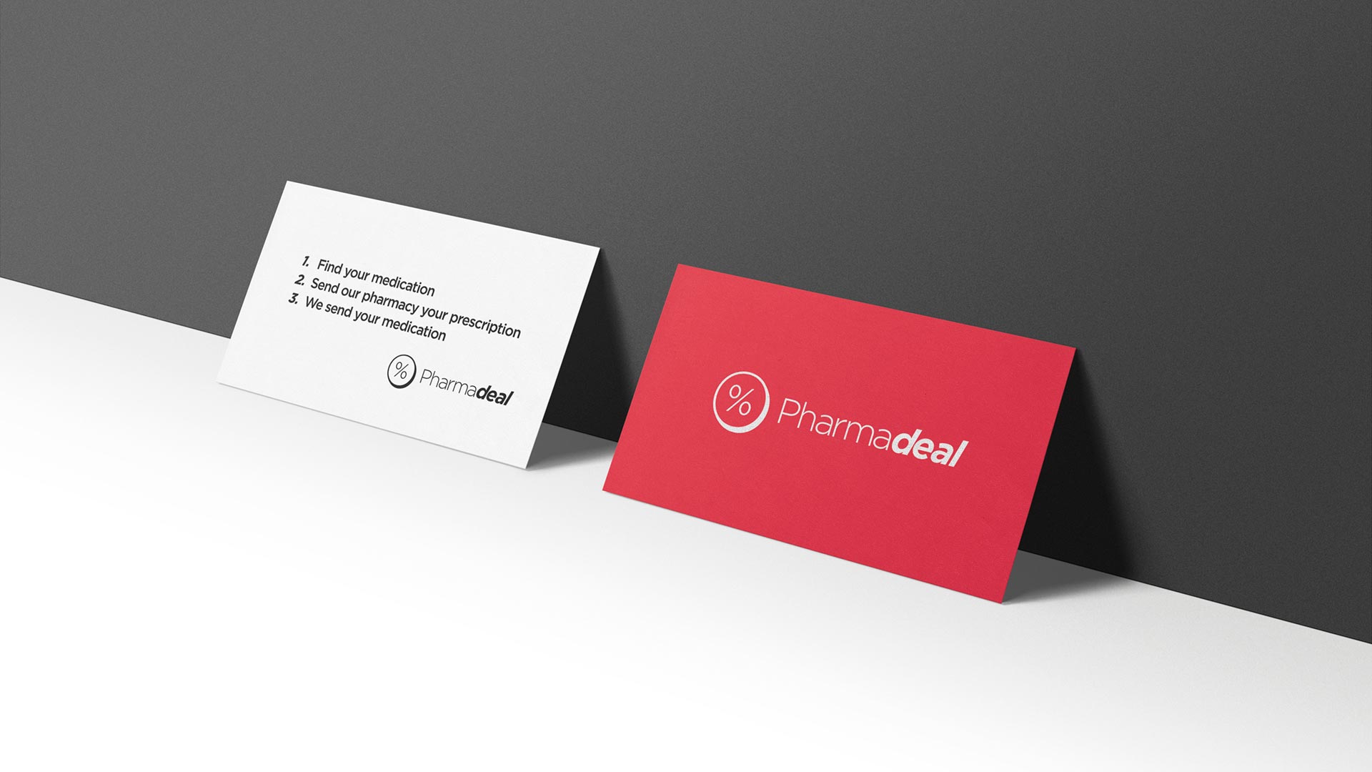
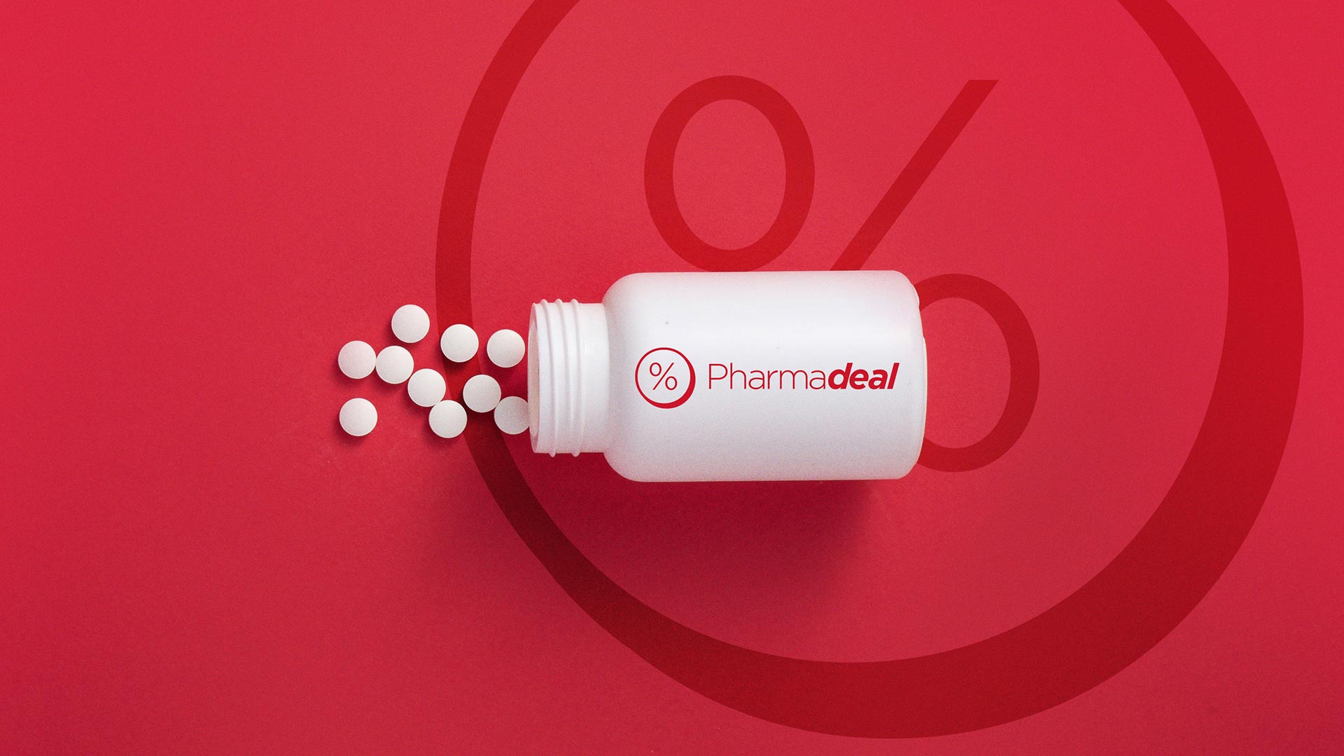
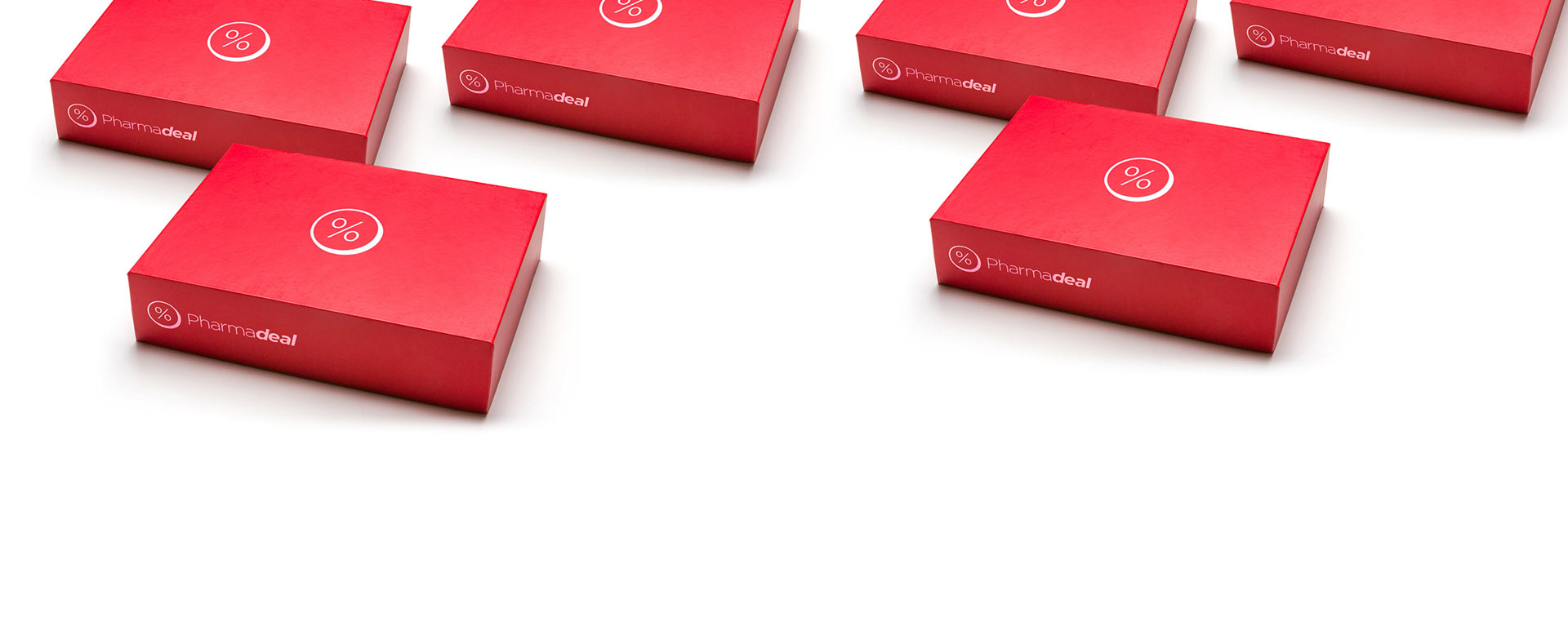
With a special shade of red color, the brand identity is consistent in all uses. On the other hand, just like the name, the % sign representing the affordable price and the round form (with a thickness) representing the drug also form the emblem. A simple and easy-to-remember design language is naturally complemented by a plain typeface.
After creating the brand diagnosis, I Mean It Creative completed the naming and verbal identity studies. Afterwards, a visual identity design was made.
Currently, the design of the website is finished and the programming continues. Testmonial videos and other branding works to be used in advertisements are still in progress.
The correct word to describe the work we do at I Mean It Creative is ‘brand consultancy’. This project is a good example of that.