City Branding for Aina Le'a

Inspired by the Hawaiian quilt we created a brandmark for the town. The four whales symbolize “gathering by the sea.”

BRANDING & ICON DESIGN

Aina Le’a Inc. is a land development company, focused on locating, planning, and building well-designed neighborhood communities for the benefit of the residents of the community and our shareholders and partners.

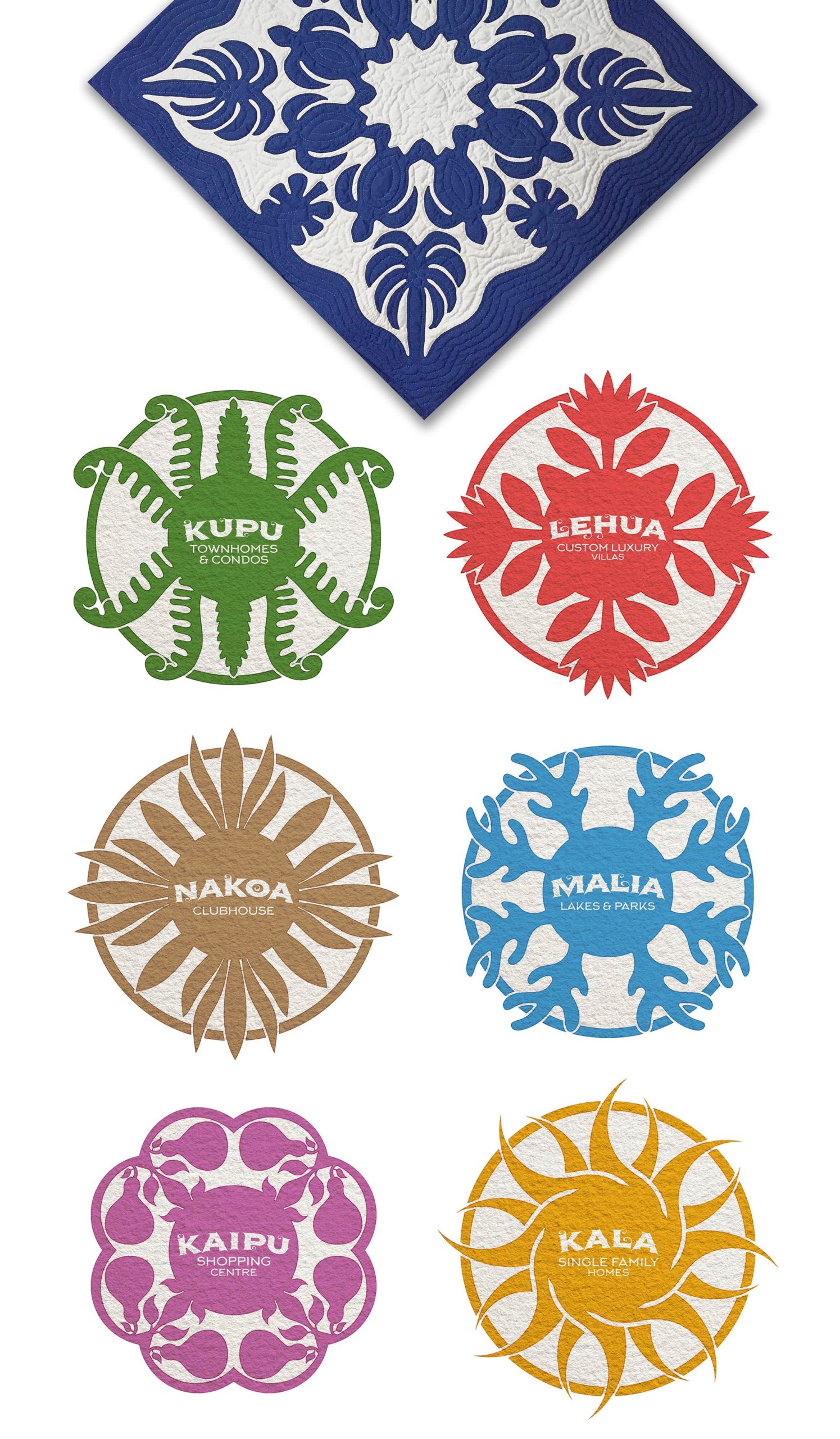
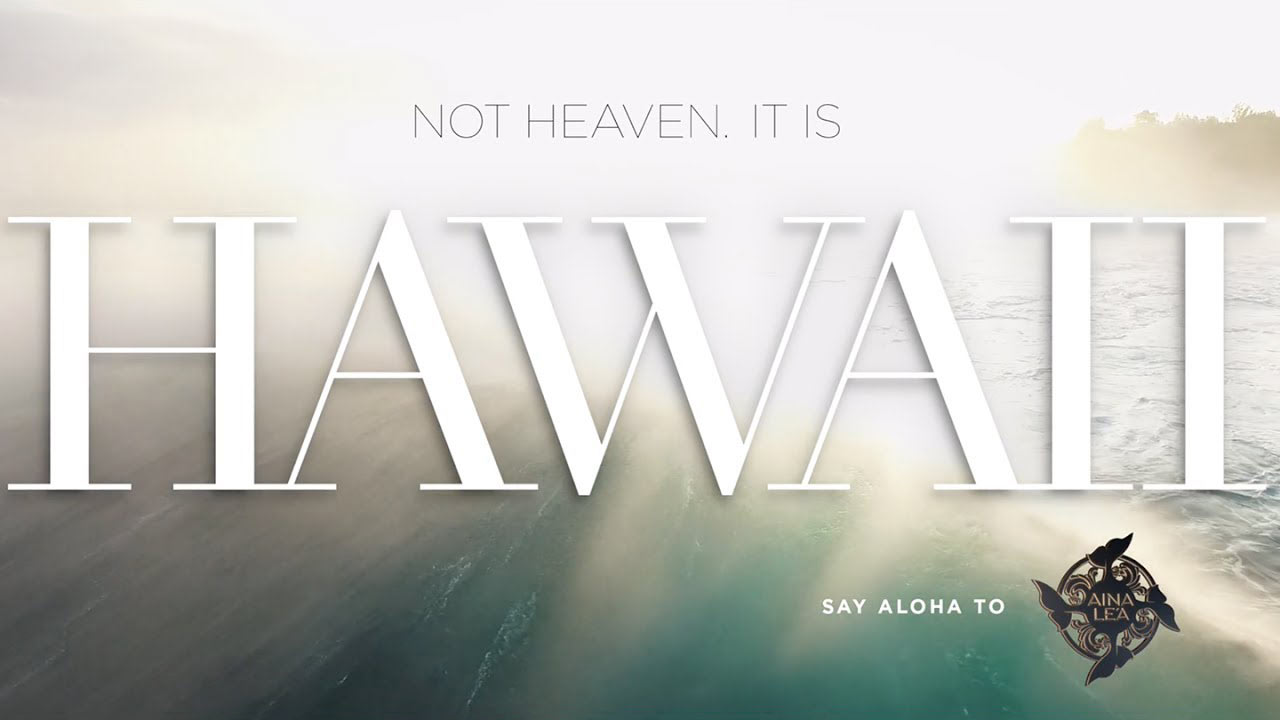
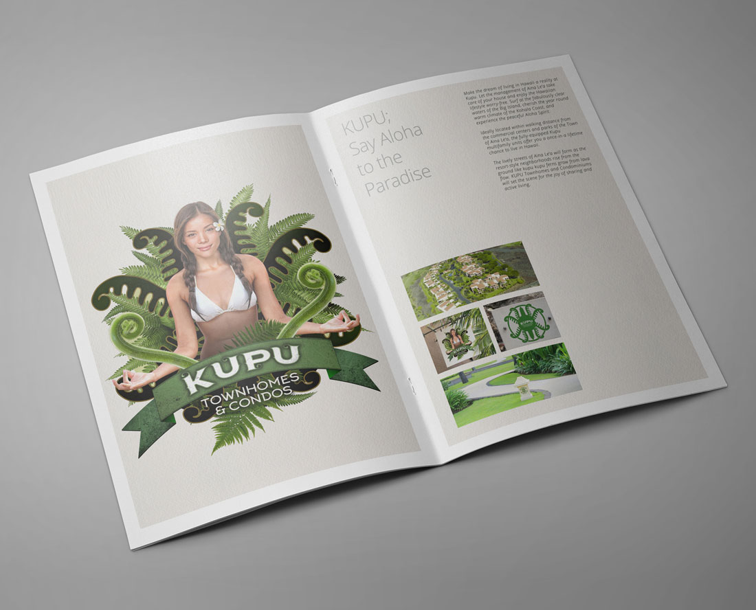
With an investment of $80 million, the company acquired 1,100 acres of raw land in the Island of Hawai’i to develop the Town of Aina Le’a. The Master Plan consists of luxury villas, vacation homes, restaurants, shops, natural parks, service facilities. To bring its vision to life and turn the town into a real, living, upscale community, Aina Le’a Inc. hired I Mean It.

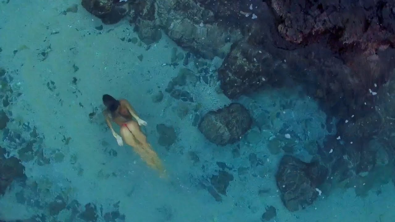
Nestled amongst the marvelous lava rock fields, and overlooking the white powder sand beaches and fabulously clear waters of the Gold Coast, the Town of Aina Le’a is envisioned to be the place of gathering for the affluent, somewhere they can live tastefully by the water while experiencing Hawaii’s authentic values.

With this vision in mind, our first task was to create a holistic visual identity for the Town, which would reflect its three unique characteristics: luxury, beach, and Aloha Spirit.

First, Inspired by the Hawaiian quilt we created a brandmark for the town. The four whales symbolize “gathering by the sea.” Next, we developed an authentic nomenclature for the six villages of the Town Aina Le’a. Then, we designed visual identity for each community by using Hawaiian motifs. Finally, we brought the Town of Aine Le’a by applying the new identity throughout all touch-points, ranging from stationery to signage, sales brochures, and uniforms.

COMMERCIAL

We created a promotional video that blended the sublime diversity and idyllic wonders of the island with the escapist fantasy, in which we all want to indulge.

I Mean It created the concept, crafted the script, coordinated the production, and prepared the final cut of the commercial.

CATALOGUE DESIGN

3D LOGO ANIMATION

KAIPU VILLAGE VISUAL IDENTITY

The name of the shopping center was inspired by a Hawaiian legend. We simplified the word “Ka Ipu o Ka ‘Ike” -the container of knowledge- to underline the important role that the retail area would play for the residents of the town.

Our next job was to create a visual identity for Kaipu. First, we designed a brandmark by using Hawaiian motifs. Next, we created a character to personify Kaipu. And finally, the new visual identity was applied to advertisements, brochure covers, signage, uniforms, as well as the gift bags.

KALA VILLAGE VISUAL IDENTITY

The name of the single family homes was inspired by a saying in Hawaiian, “Kala I Ka Mauli Oli,” which means “the sun is the source of life.”

Our next job was to create a visual identity for Kala. Inspired by the sun, we designed a brandmark by using the motif of sun and chose yellow as a strategic color. Then, we created a character to personify Kala. And finally, we applied the new visual identity to sales brochures, signage, and uniforms.

MALIA VILLAGE VISUAL IDENTITY

The name of the lakes and park was inspired by a Hawaiian legend. We simplified the word “Malia I Ke Kai” -calm are the seas- to capture the tranquil nature of the village and the healing role it would play.

Our next job was to create a visual identity for Malia. Inspired by the peaceful and sacred waters of Hawaii, we designed a brandmark by using the motif of water and chose blue as a strategic color. Then, we created a character to personify Malia. And finally, the new visual identity was applied to sales brochures, signage, and uniforms.

KUPU VILLAGE VISUAL IDENTITY

The name of the townhomes and condos was inspired by a plant that can be found in the Hawaiian woodlands. Kupukupu is one of the first and most resilient vegetation that is seen as new growth from a young lava flow. Kupu was chosen to symbolize the growth of Aina Le’a on the lava fields of Island of Hawai’i.

Our next job was to create a visual identity for Kupu. Inspired by the kupukupu fern, we designed a brandmark by using the motif of plant and chose green as a strategic color. Then, we created a character to personify Kupu. And finally, we applied the new visual identity to business cards, signage, and sales brochures.

NAKOA VILLAGE VISUAL IDENTITY

The name of the clubhouse was inspired by a local plant. Standing tall in the Hawaiian forest is the Koa tree, the most desired and revered of the Hawaiian hardwood trees.

Our next job was to create a visual identity for Nakoa. Inspired by nature, we designed a brandmark by using the motif of Koa tree and chose brown as a strategic color. Then, we created a character to personify Nakoa. And finally, the new visual identity was applied to sales brochures, signage, and uniforms.

LEHUA VILLAGE VISUAL IDENTITY

The name of the custom luxury villas was inspired by a plant that can be found in Hawaiian islands. Lehua blossom is believed to be one of the most beautiful and delicate forms of the Pele, the goddess of fire and of the volcano.

Our next job was to create a visual identity for Lehua. Inspired by the Lehua blossom, we designed a brandmark by using the motif of the flower and chose red as a strategic color. Then, we created a character to personify Lehua. And finally, we applied the new visual identity to vehicles, signage, and sales brochures.